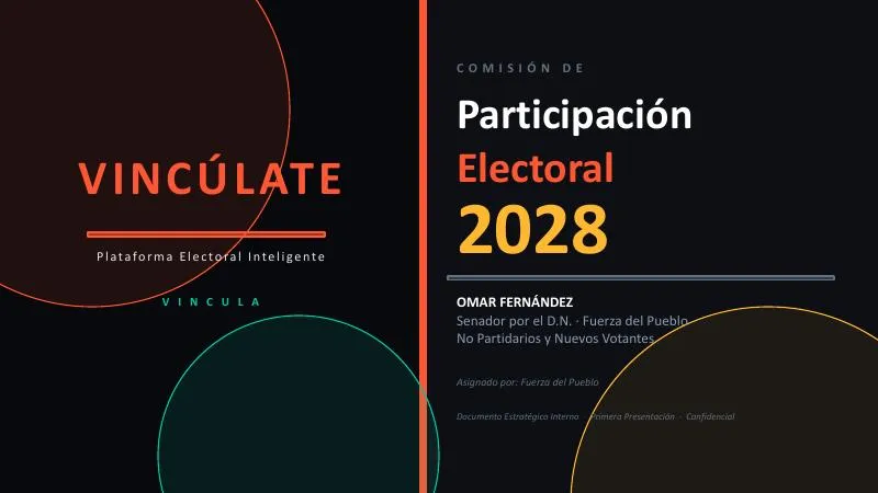
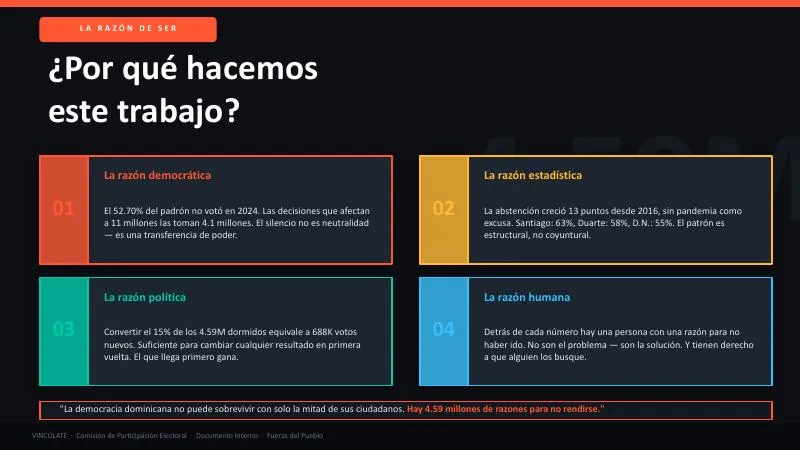
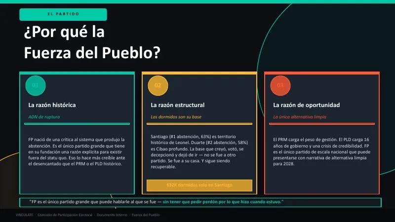
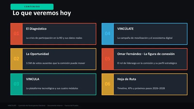
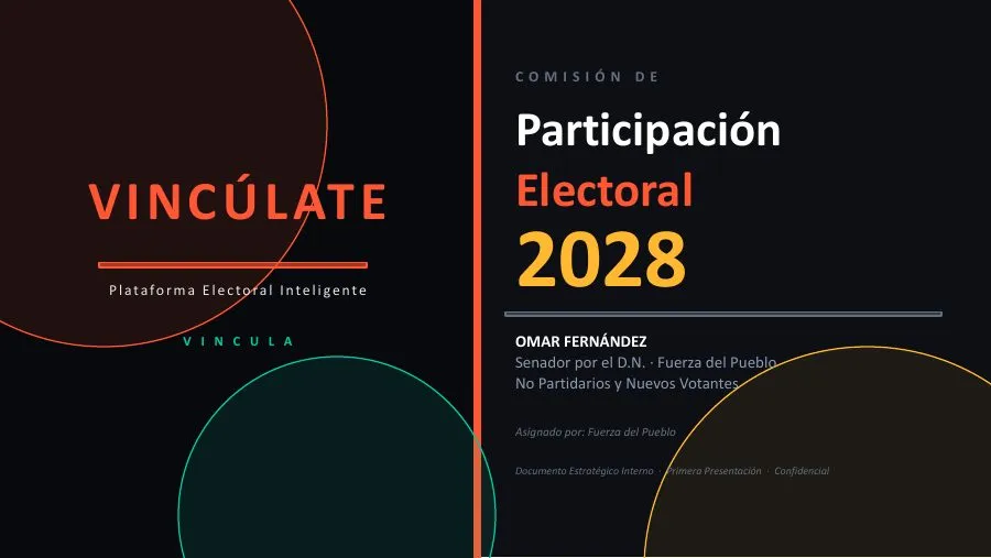
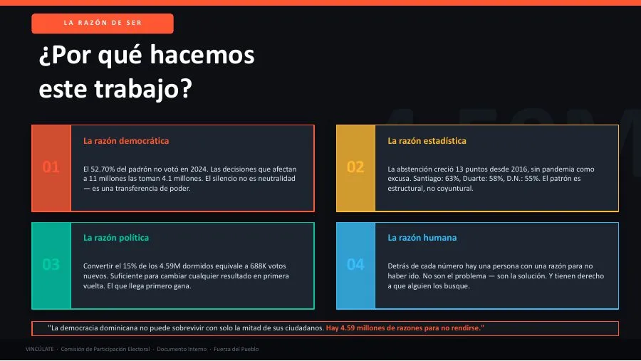
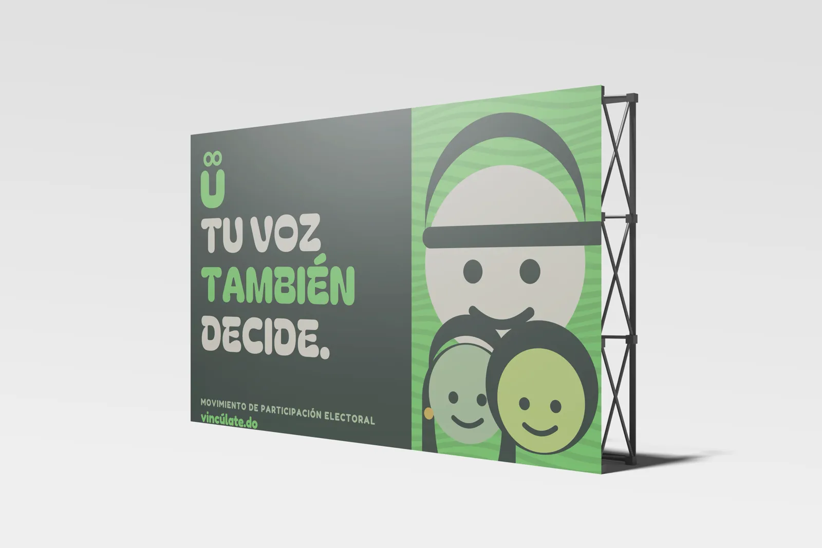
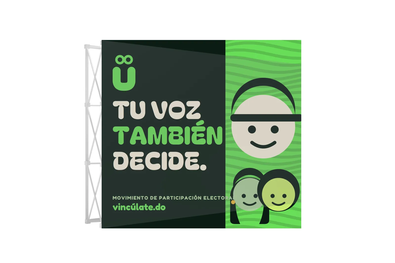
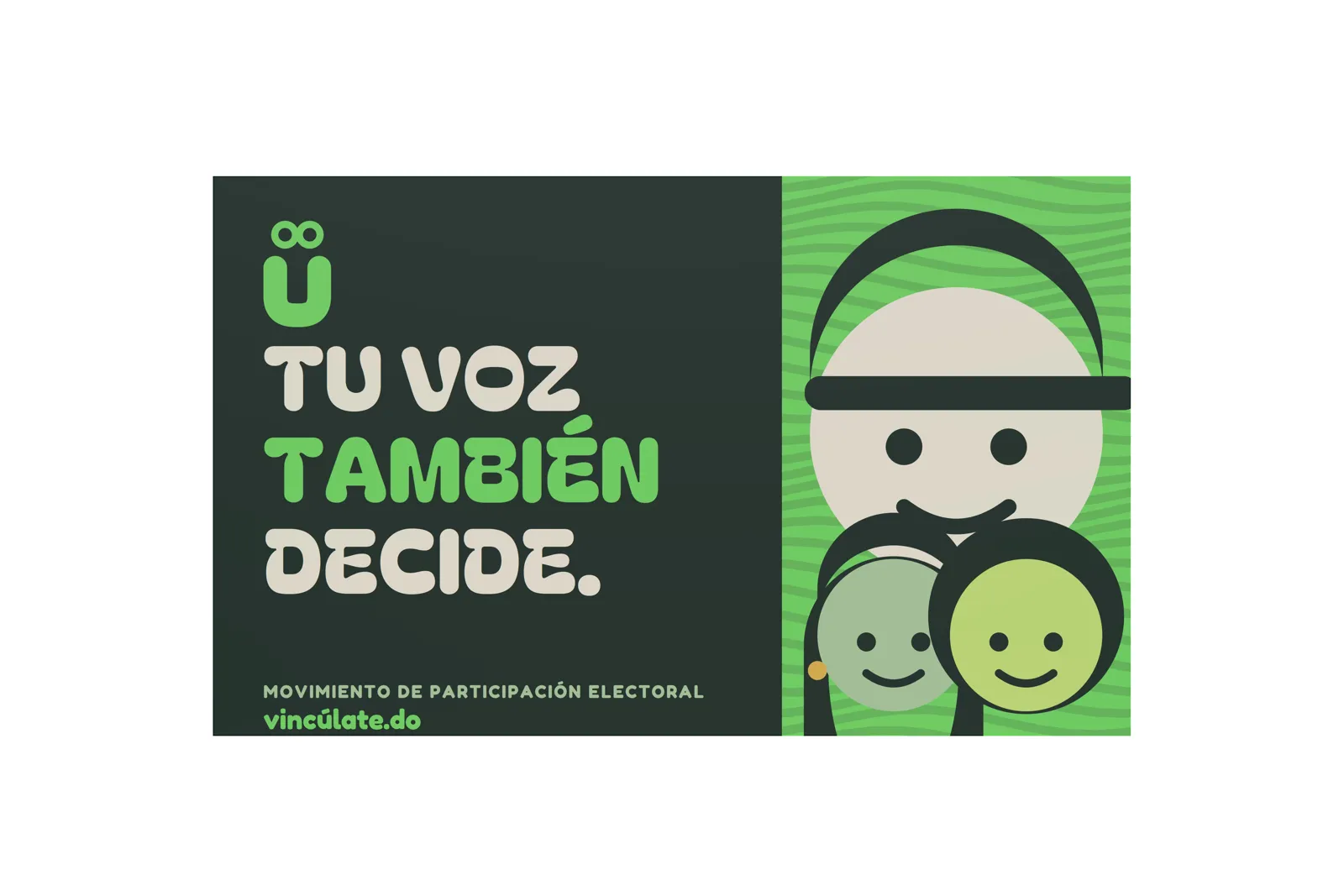
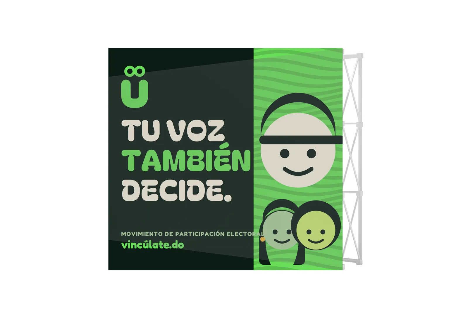
Vincúlate needed a visual language able to grow from a brand into digital products.
The project included identity, illustration, a landing page, VINCULA screens and a game prototype. Everything had to grow from the same components.
How we approached it
Design components, document them and test them in interfaces.
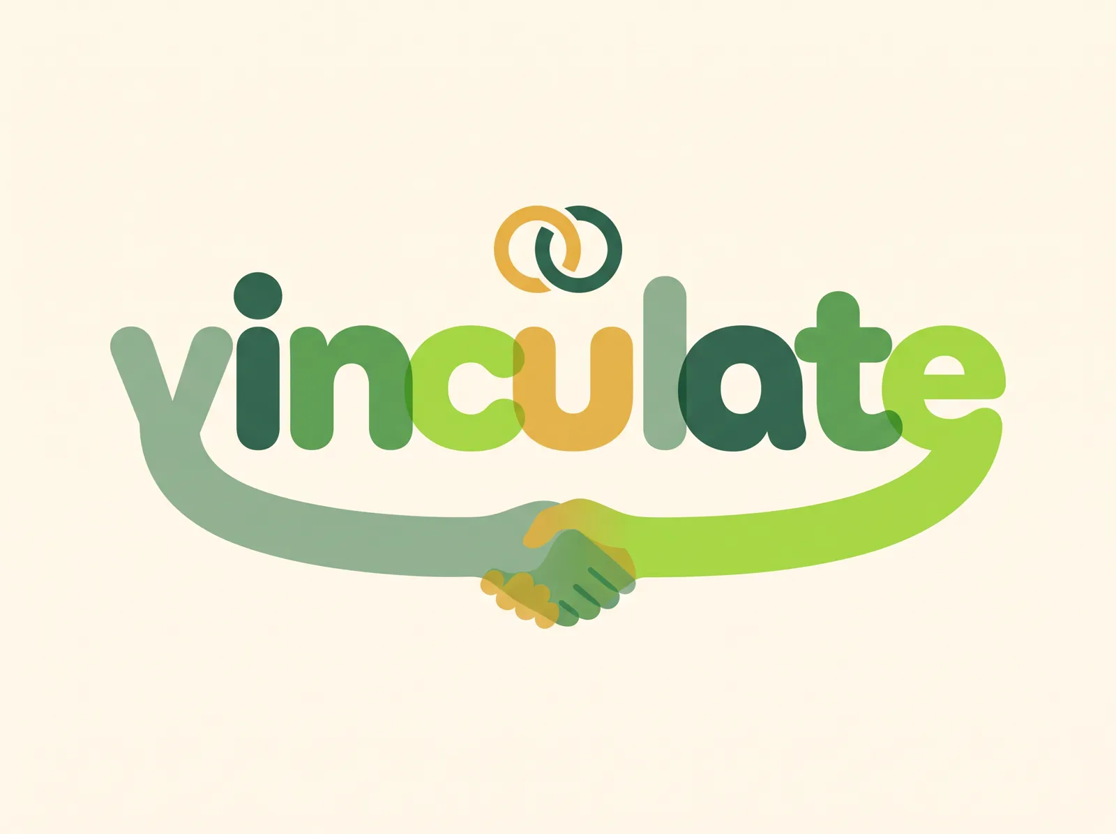
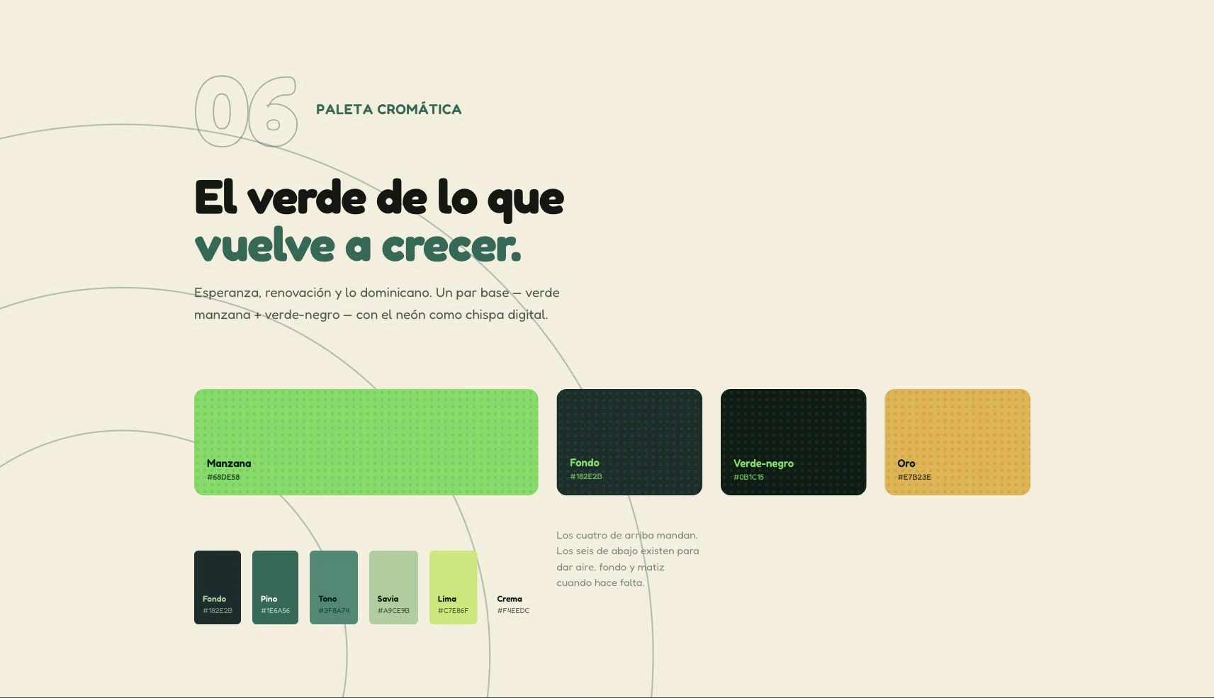
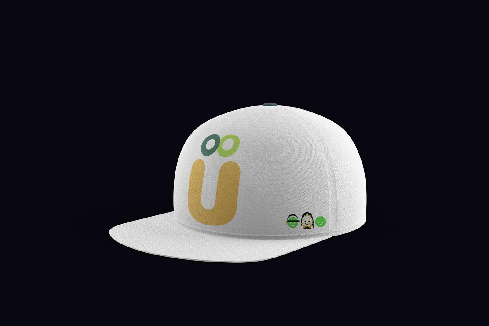
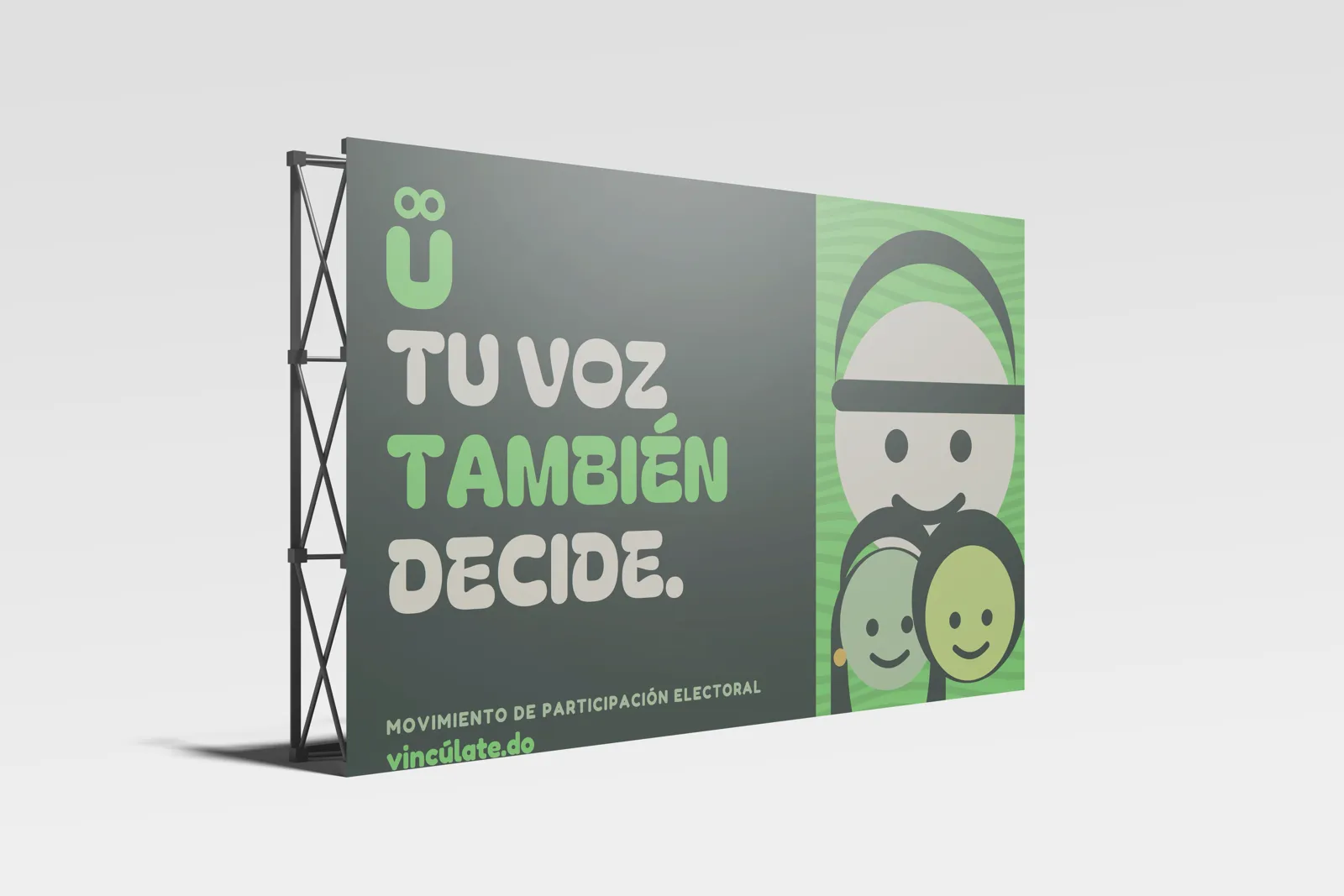
Colour. Apple green #68DE58, green-black #0B1C15 and gold #E7B23E, extended with pine, sage, lime and cream.
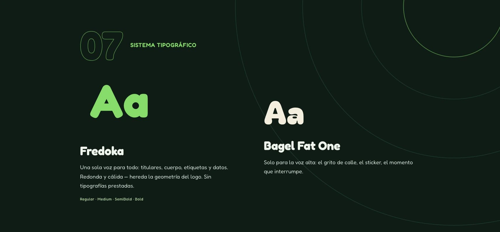
Typography. Fredoka as the main family and Bagel Fat One for occasional use.
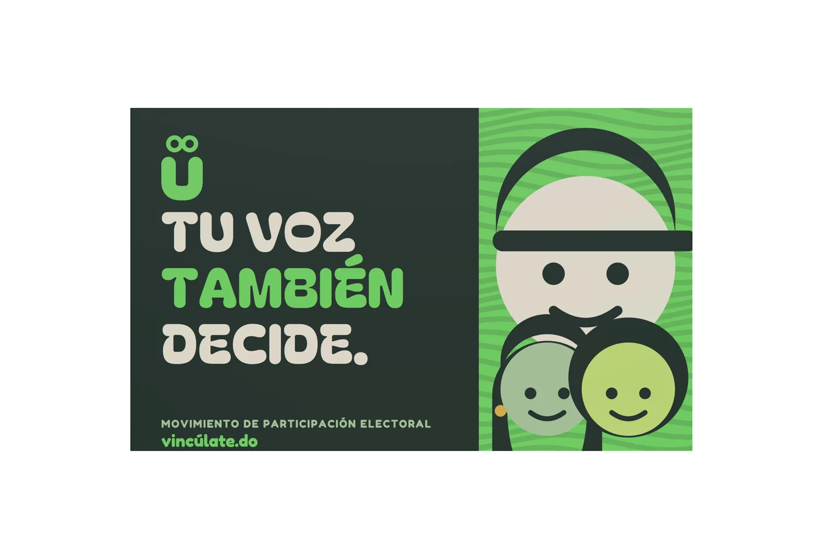
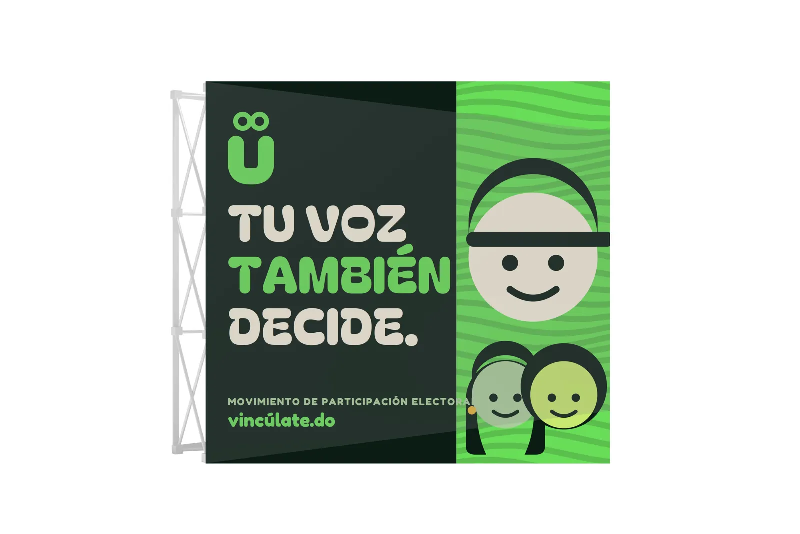
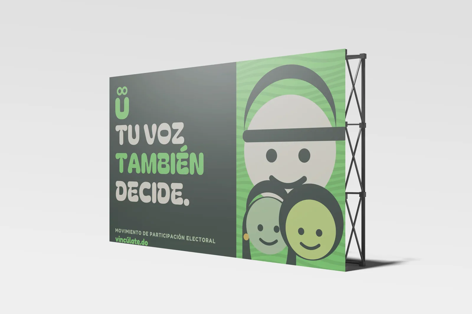
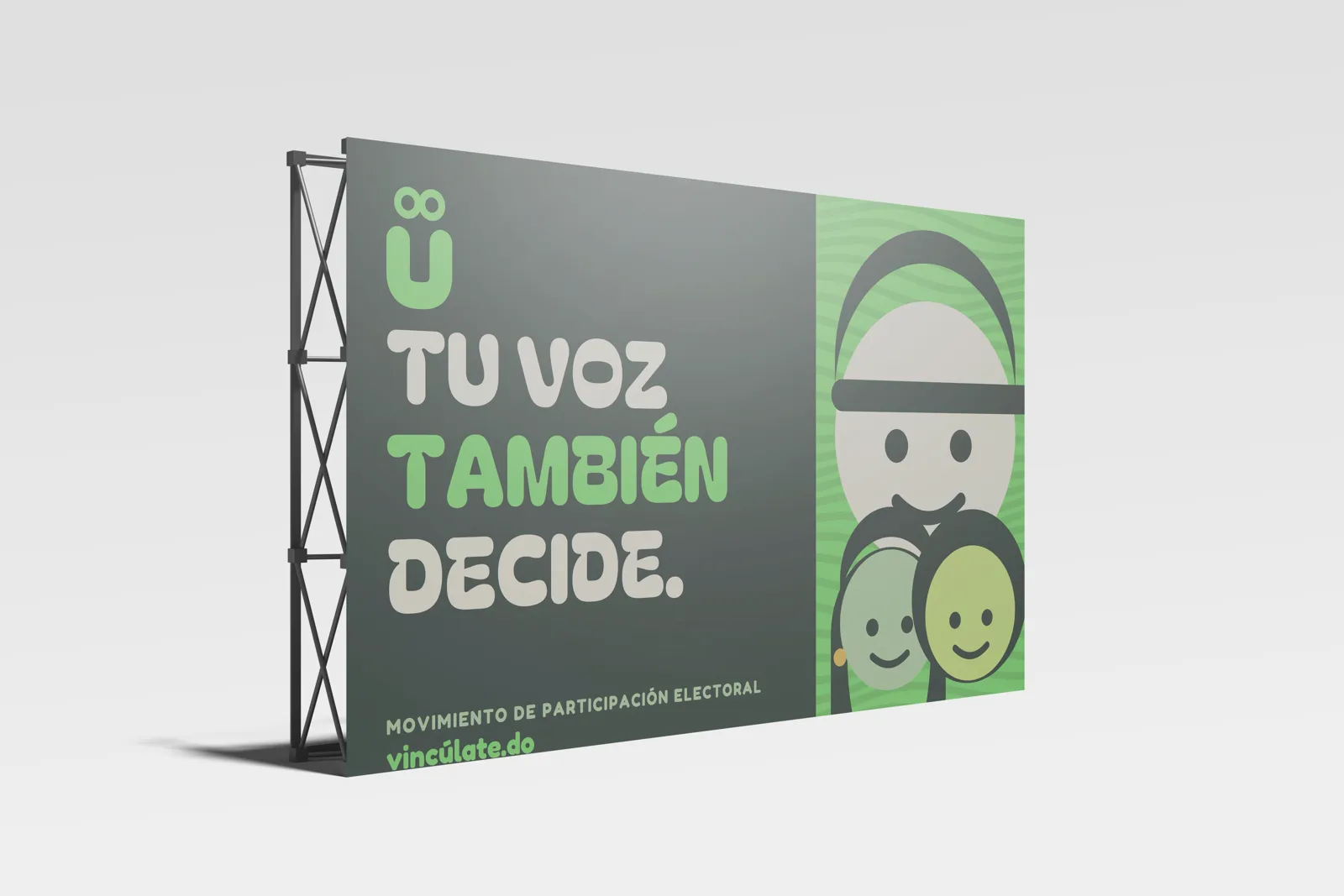
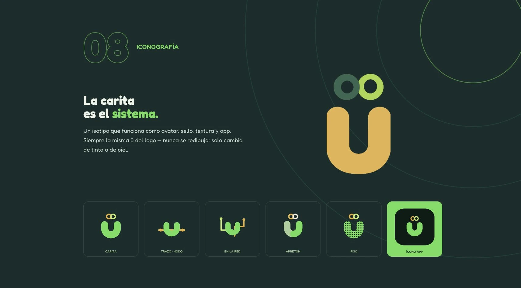
Iconography and illustration. A facial component that generates icons and illustrations.
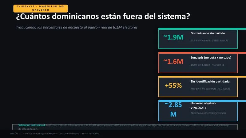
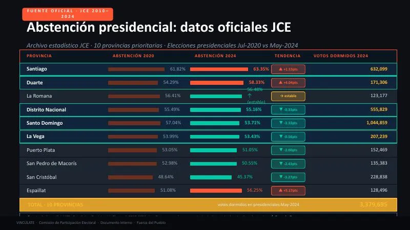
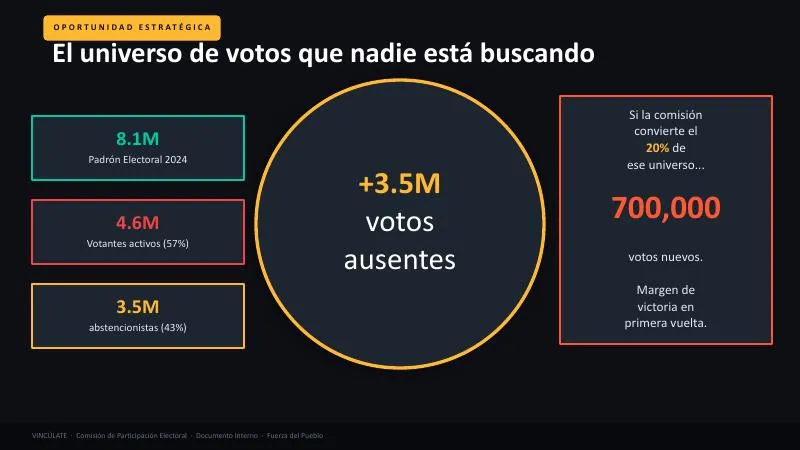
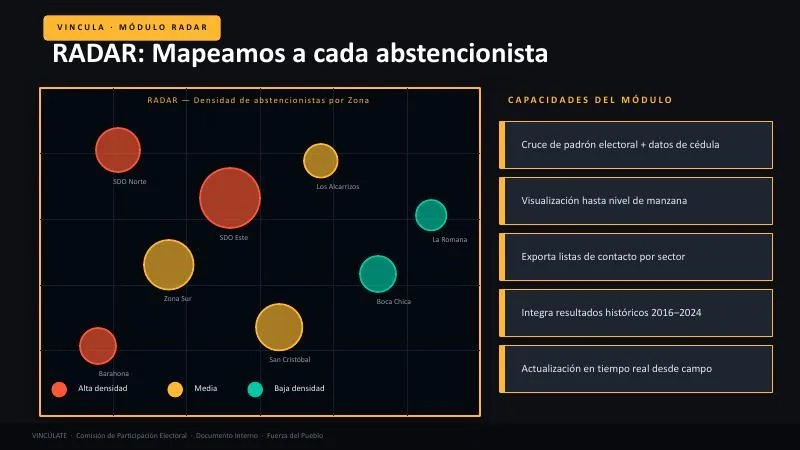
Interfaces. Landing page, VINCULA screens and a game prototype.
Research. Pilot survey reports.
A pilot survey as a starting point
Pilot survey reports are preserved. The case does not reproduce individual data or generalise from a pilot sample.
One component, many applications
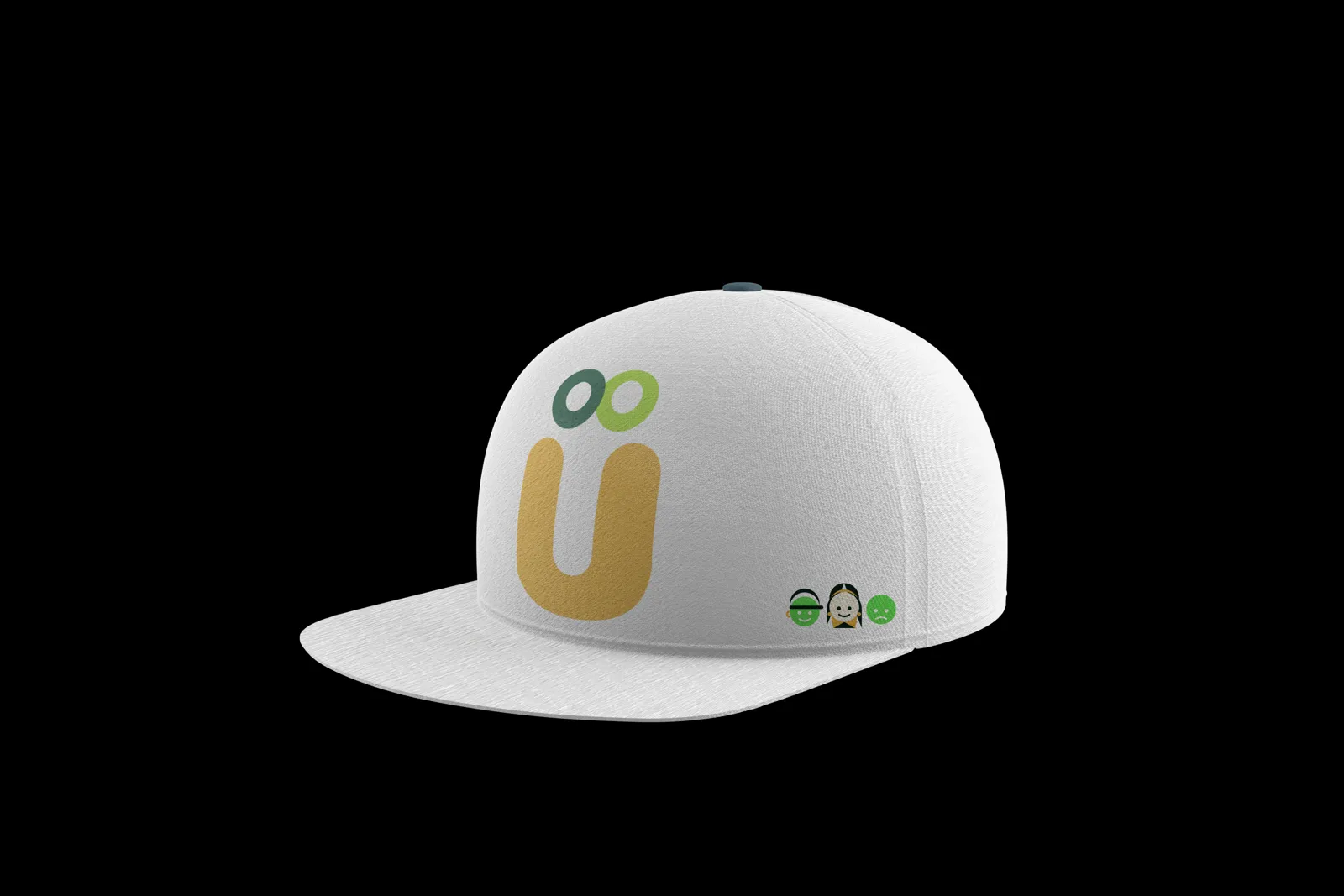
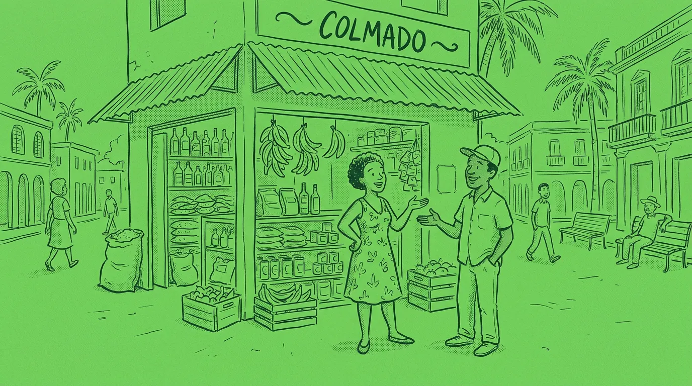
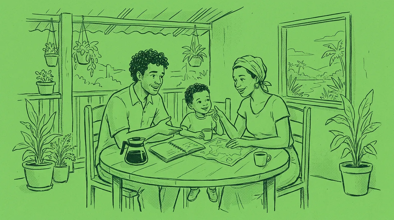
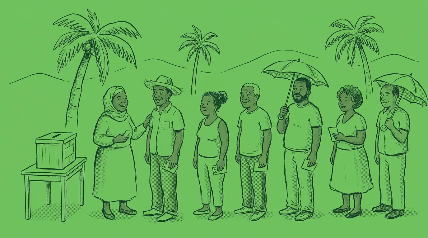
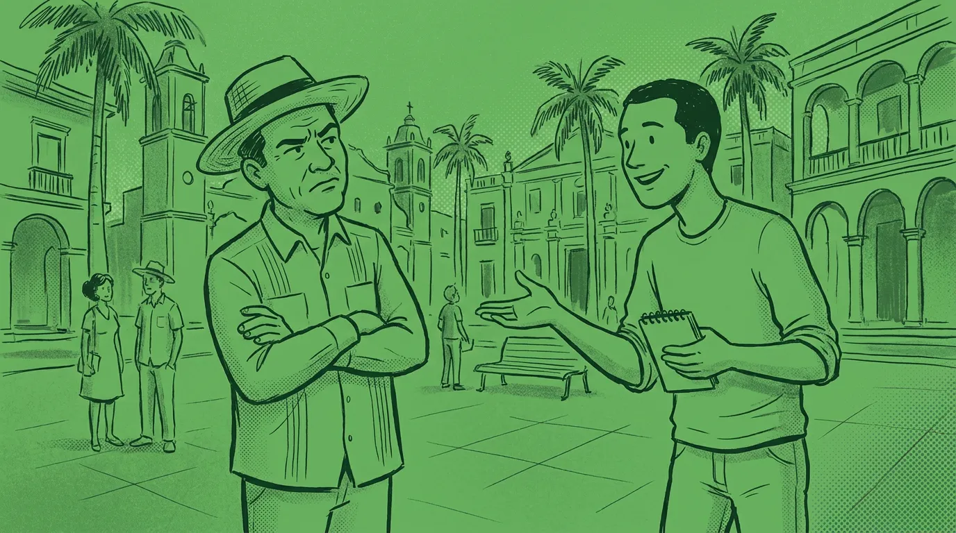
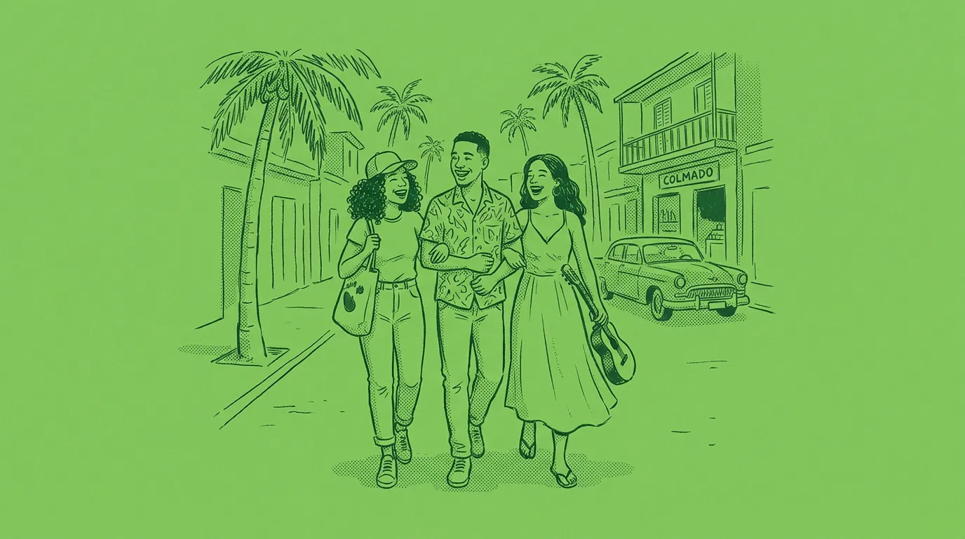
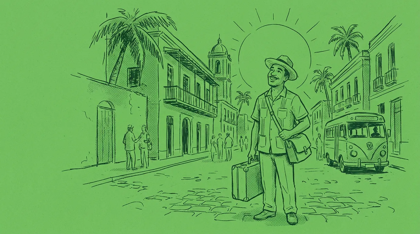
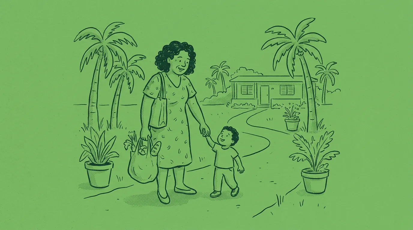
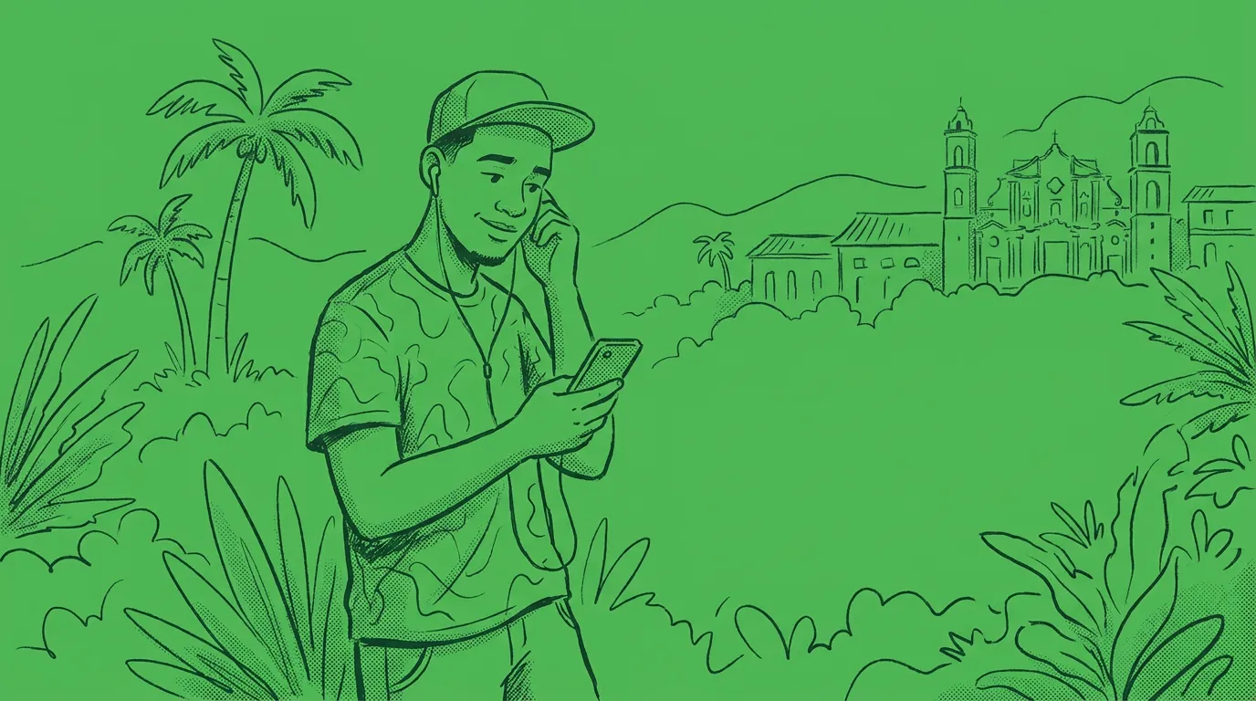
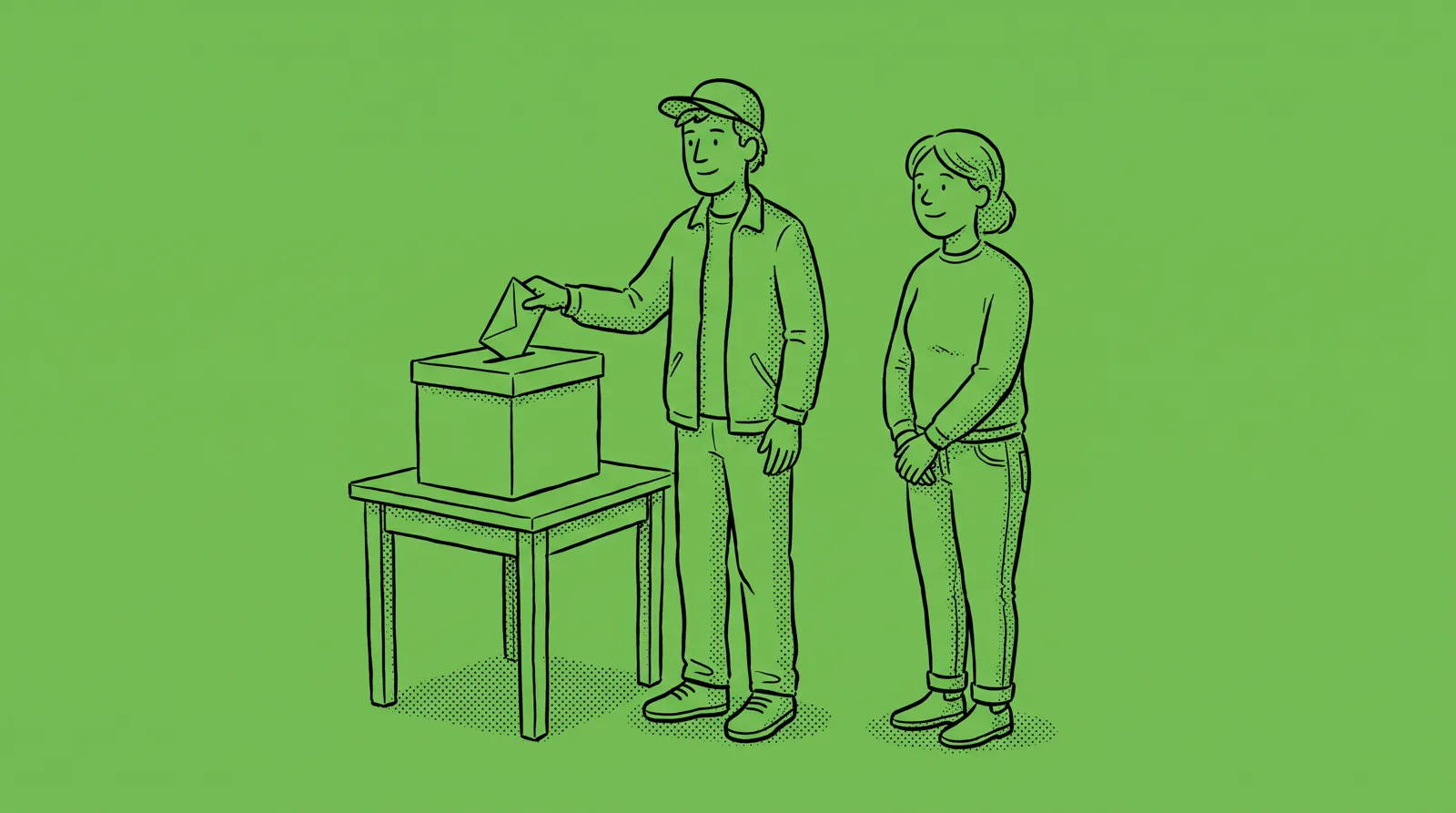
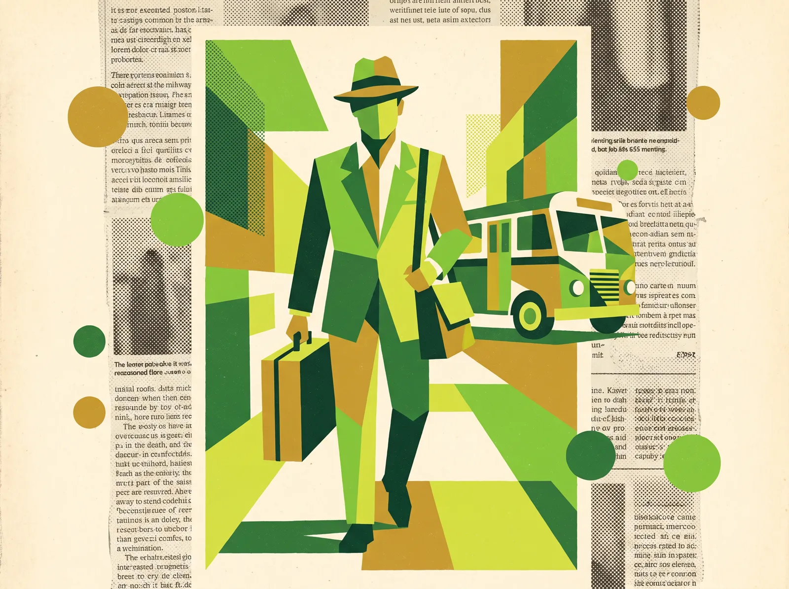
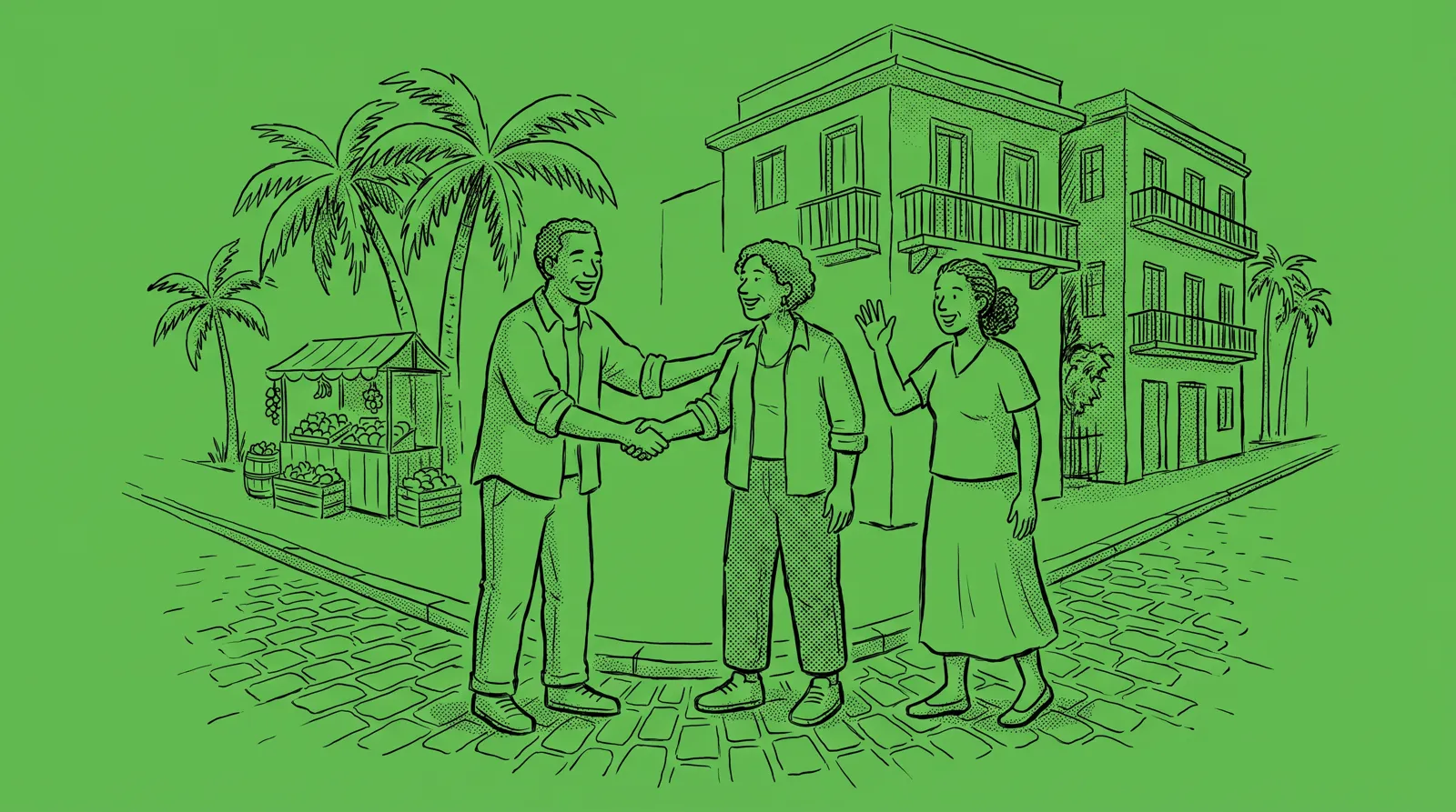
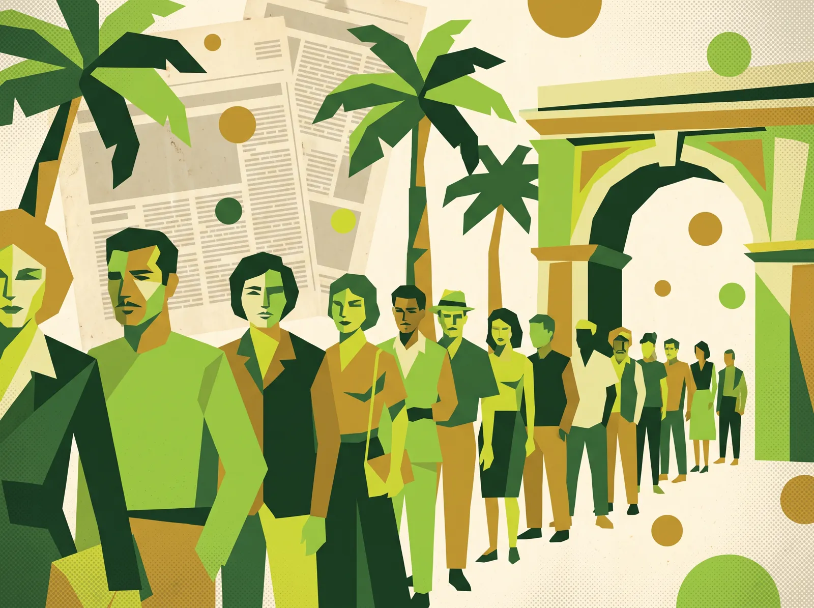
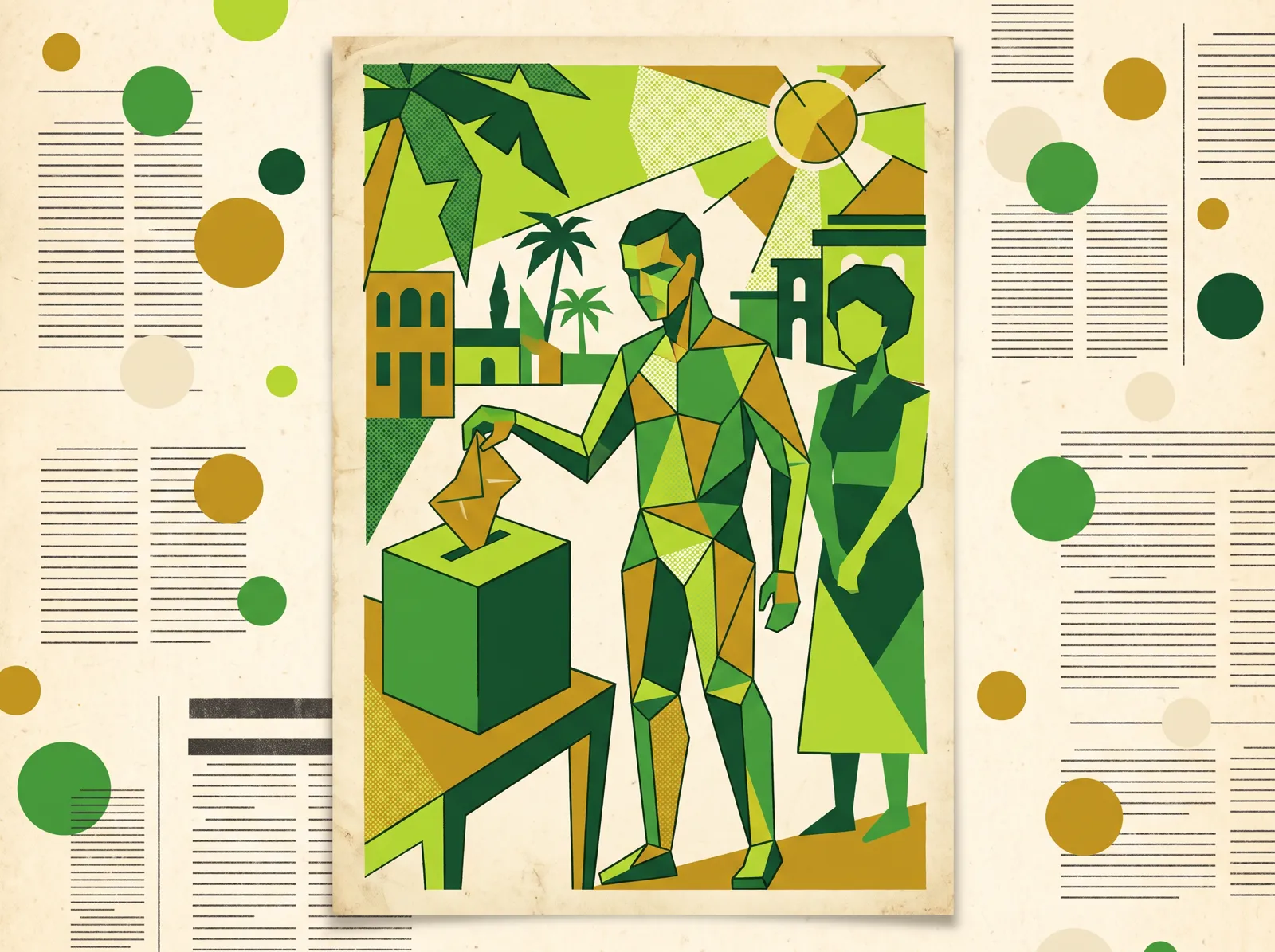
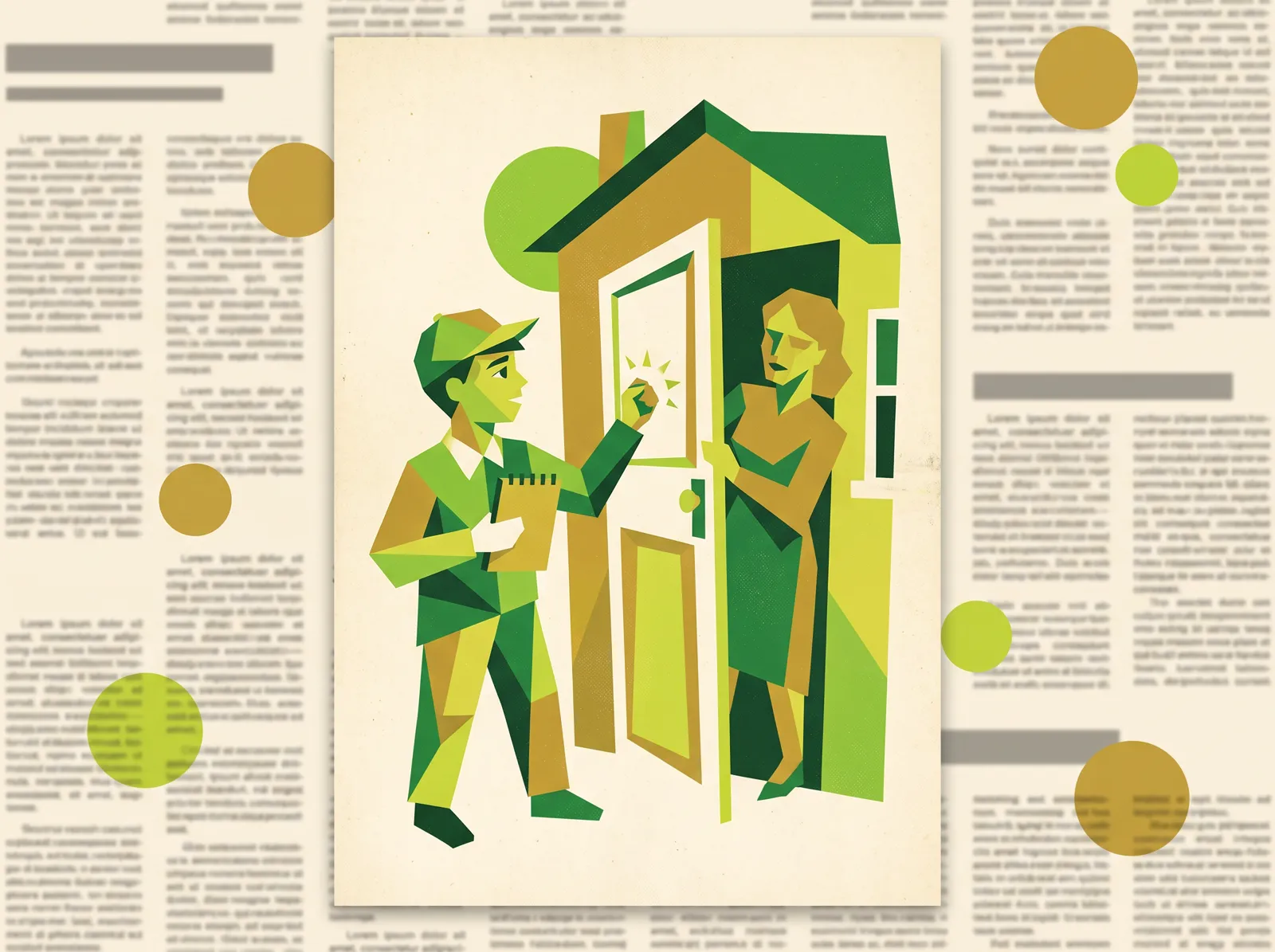
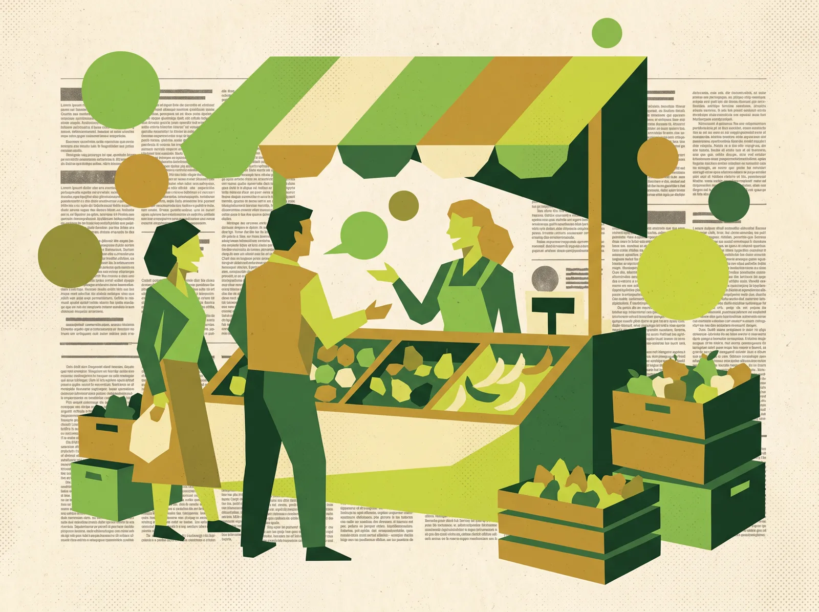
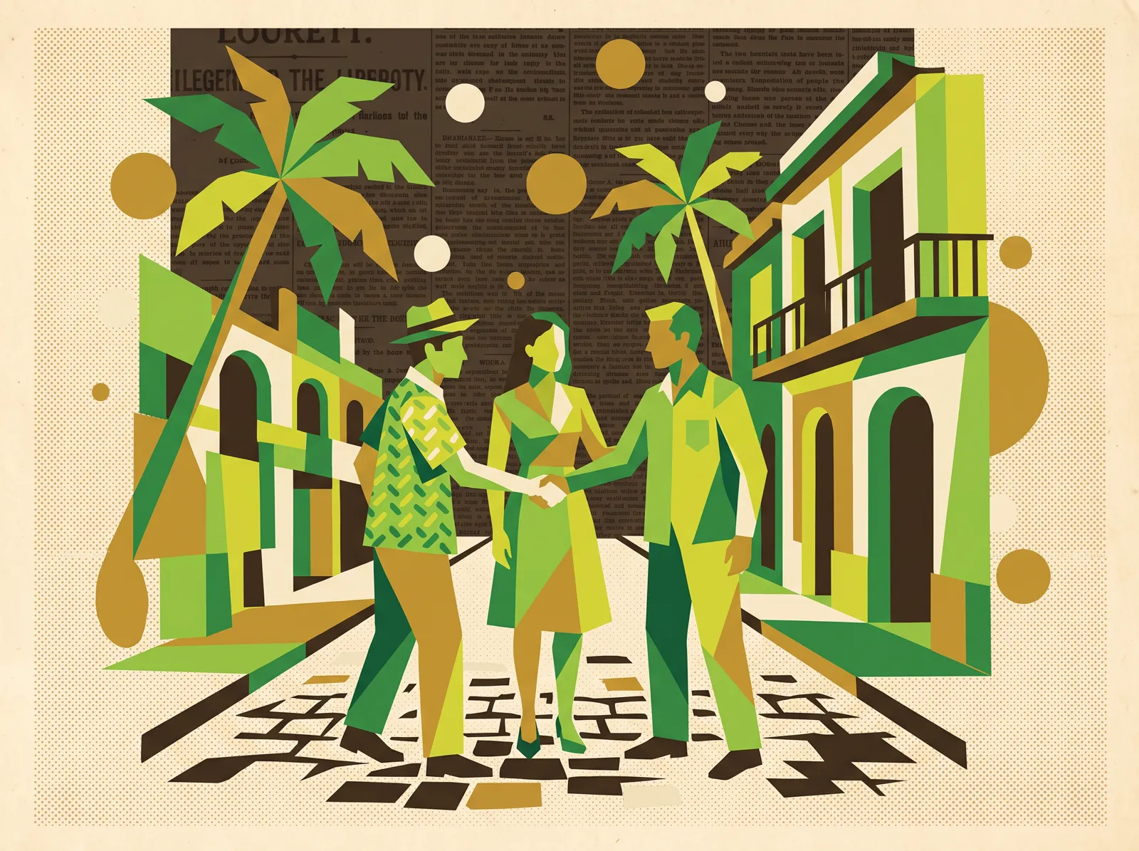
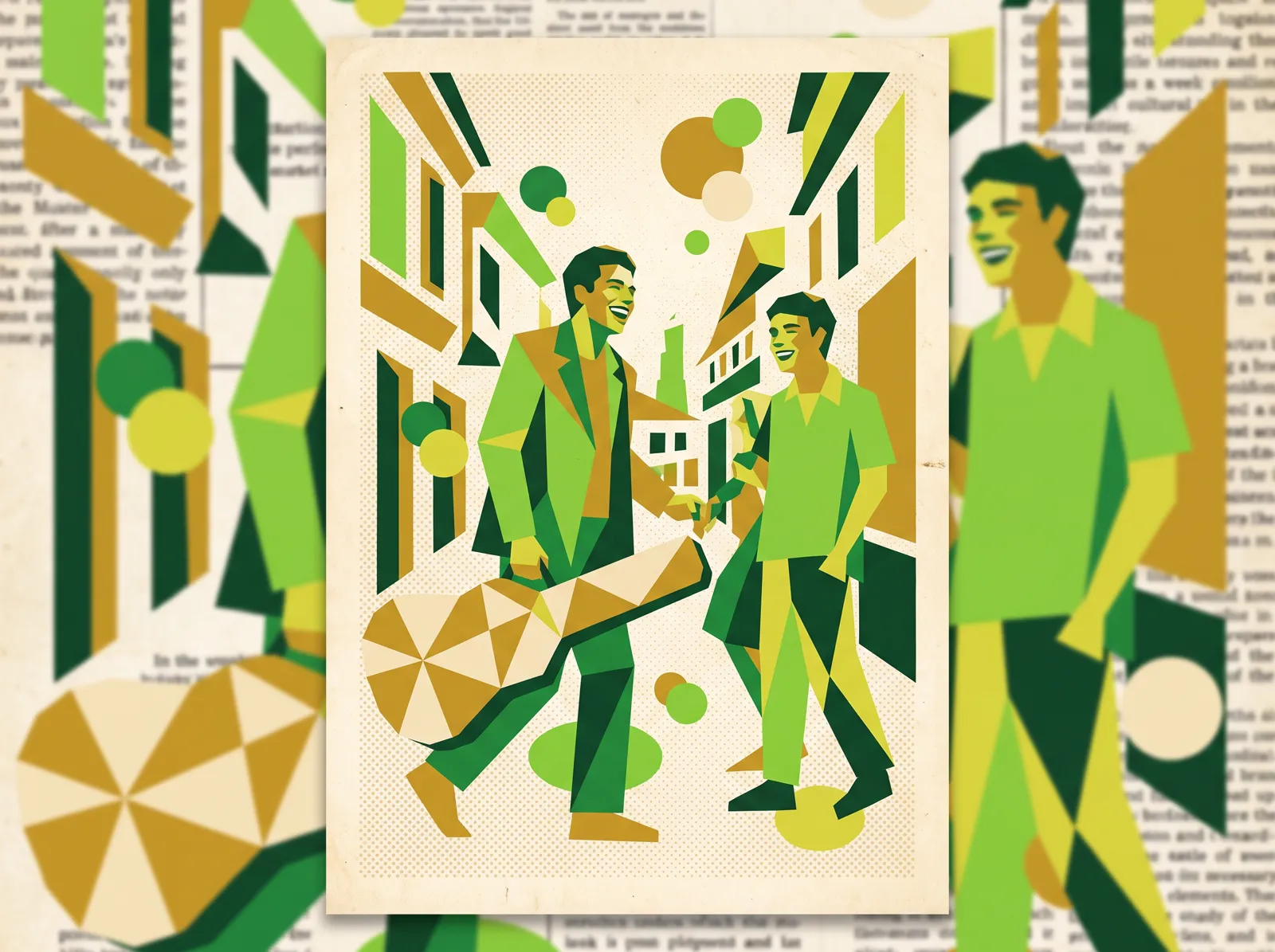
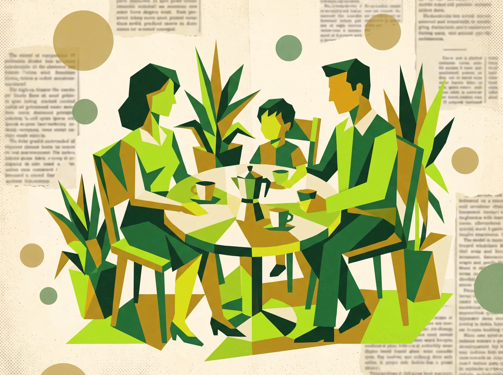
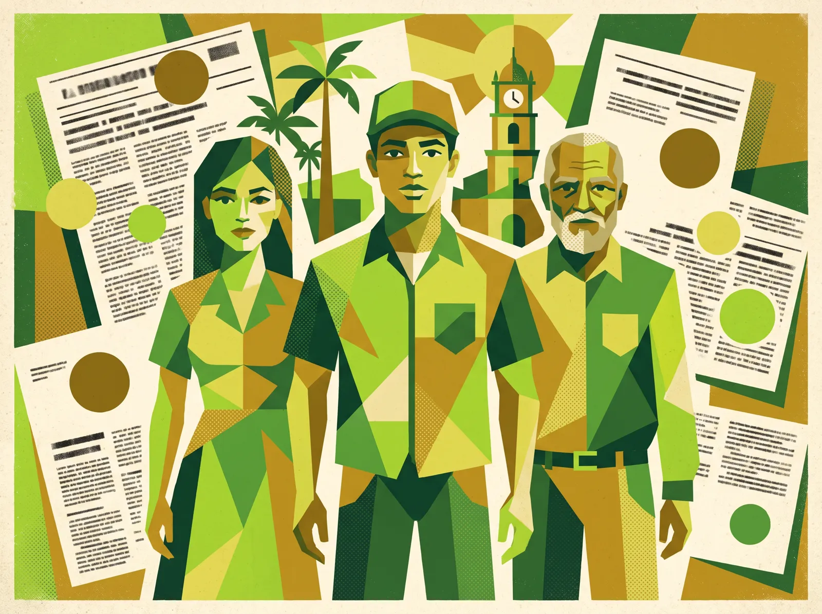
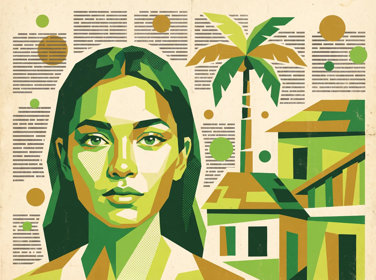
Iconography derives from the identifier's facial element, with outline, node and riso-texture variants. Illustrations use colour fields, circular heads and geometric eyes.
The landing page, VINCULA screens and game prototype are documented as interface design and functional exploration, not as deployed products.
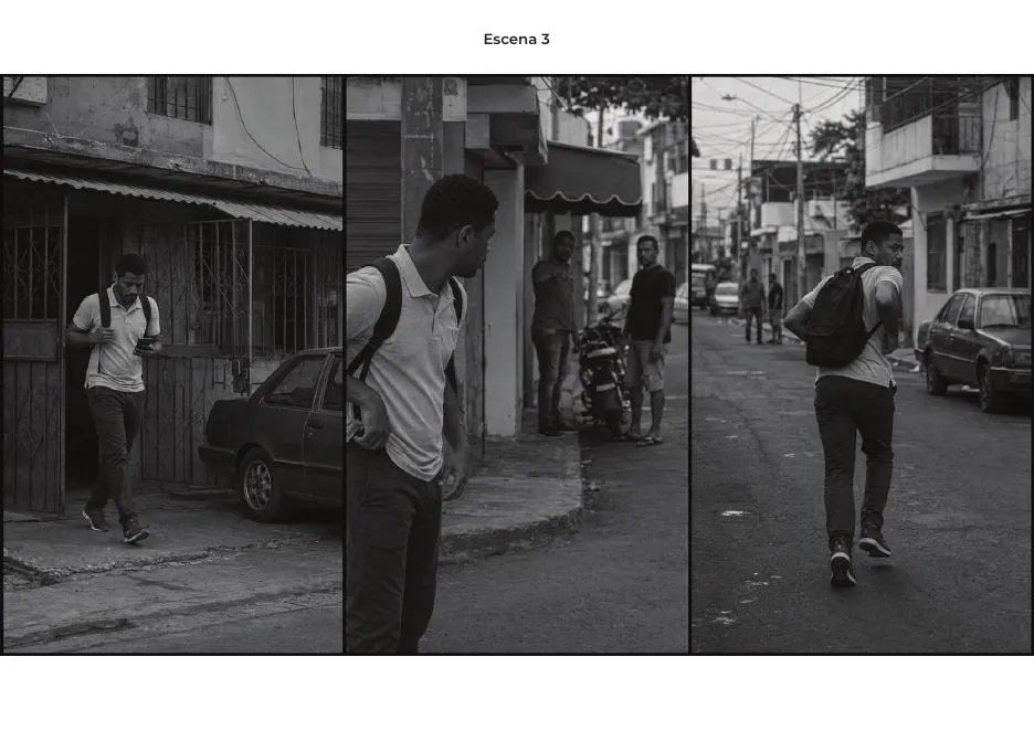
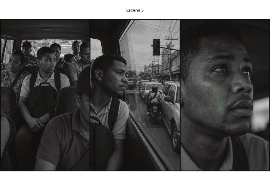
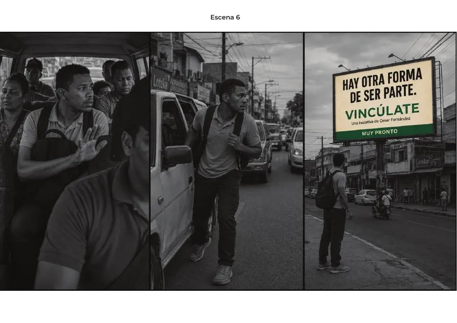
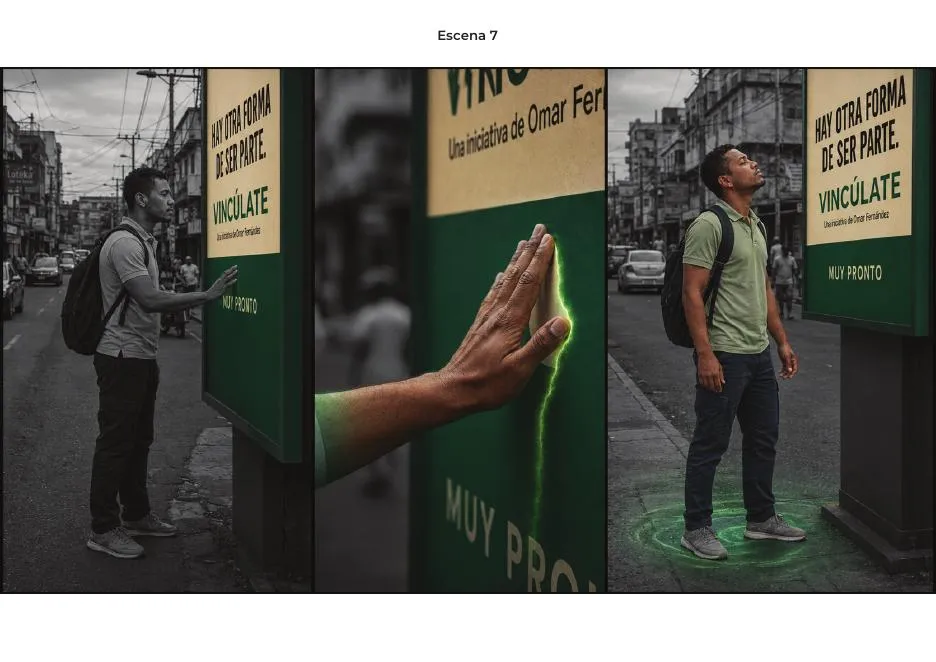
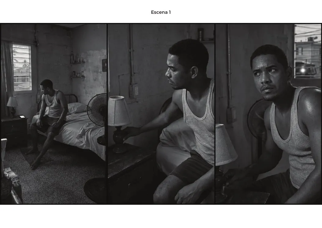
Iconografía del sistema · lámina del archivoPaleta cromática · lámina del archivoSistema tipográfico · espécimen técnicoStoryboardStoryboardStoryboardStoryboardStoryboardStoryboardPresentaciónPresentaciónPieza finalPieza finalPieza finalPieza finalPieza finalPieza final