The challenge
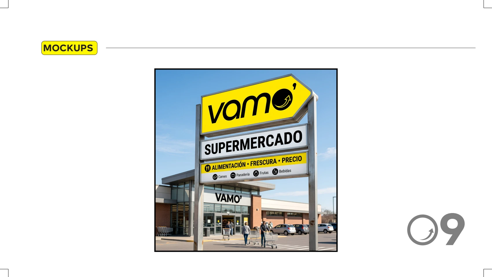
A supermarket needs a brand that reads instantly, on the facade and on the shelf.
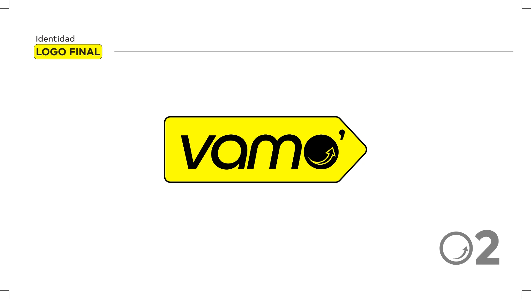
Vamo’ required its own identifier and clear rules for applying it in communication and on store surfaces.

Vamo’
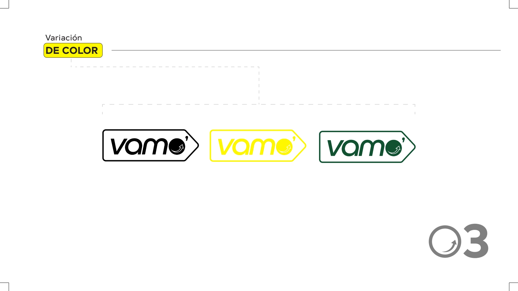
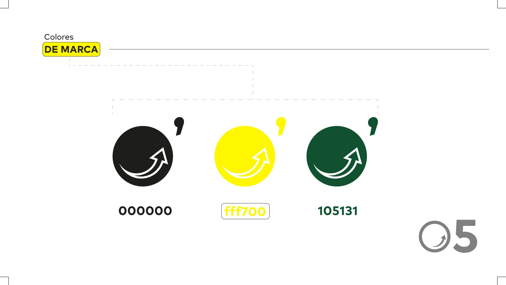
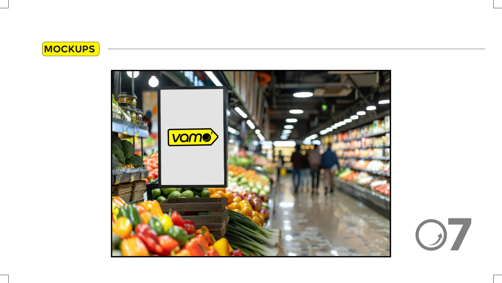
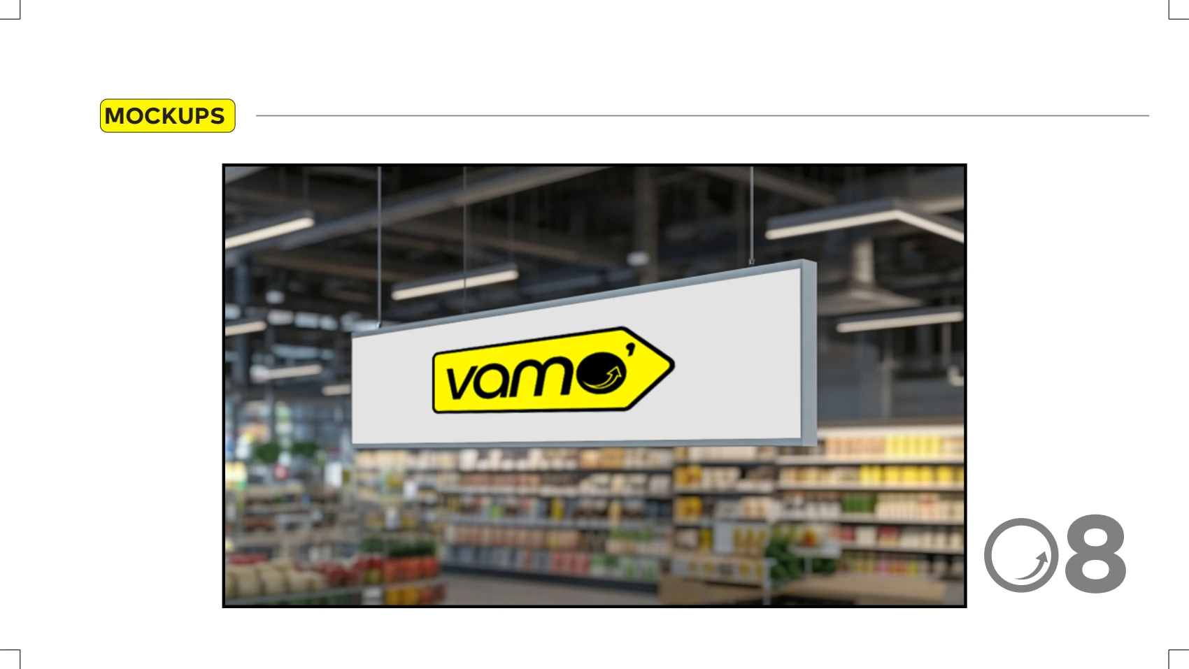
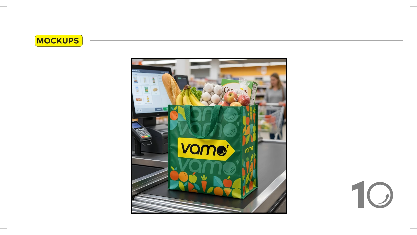
Identifier, brand guidelines and in-store applications for the Vamo’ supermarket.
Identity · Retail
A supermarket needs a brand that reads instantly, on the facade and on the shelf.
Vamo’ required its own identifier and clear rules for applying it in communication and on store surfaces.
A simple symbol and a manual that makes it repeatable.