The Wallet Marketing

Pintamax

Colour as a brand language.

Identity, brand guidelines, stationery, an institutional brochure and an execution proposal for a paint company.

Identity · Editorial · Design

The challenge

Pintamax needed a brand of its own and the pieces to present itself as a company.

A paint company sells colour. The identity had to use it as a graphic resource and hold up across stationery, institutional material and point-of-sale applications.
How we approached it

From the brand proposal to real applications.

  1. Brand proposal. A presentation of the concept, the P symbol and the colour palette.
  2. Brand guidelines. A manual with the rules for using the identity.
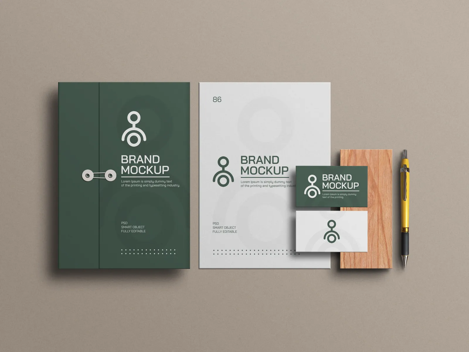
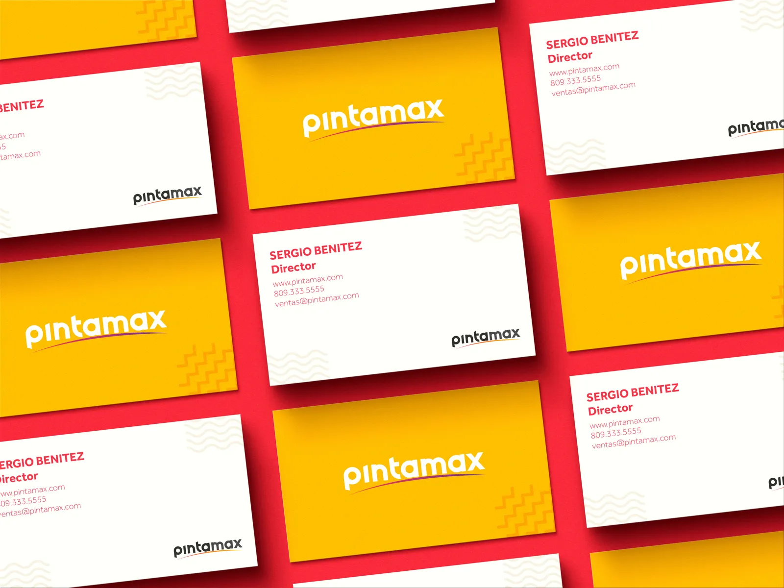
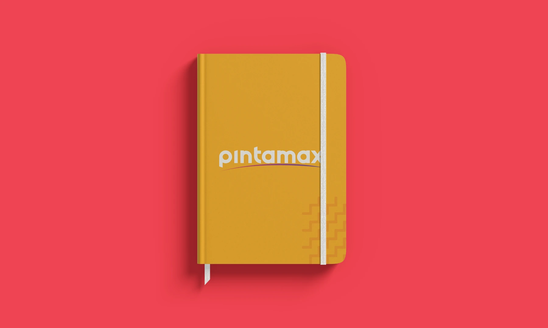
  3. Stationery. Business cards and letterhead.
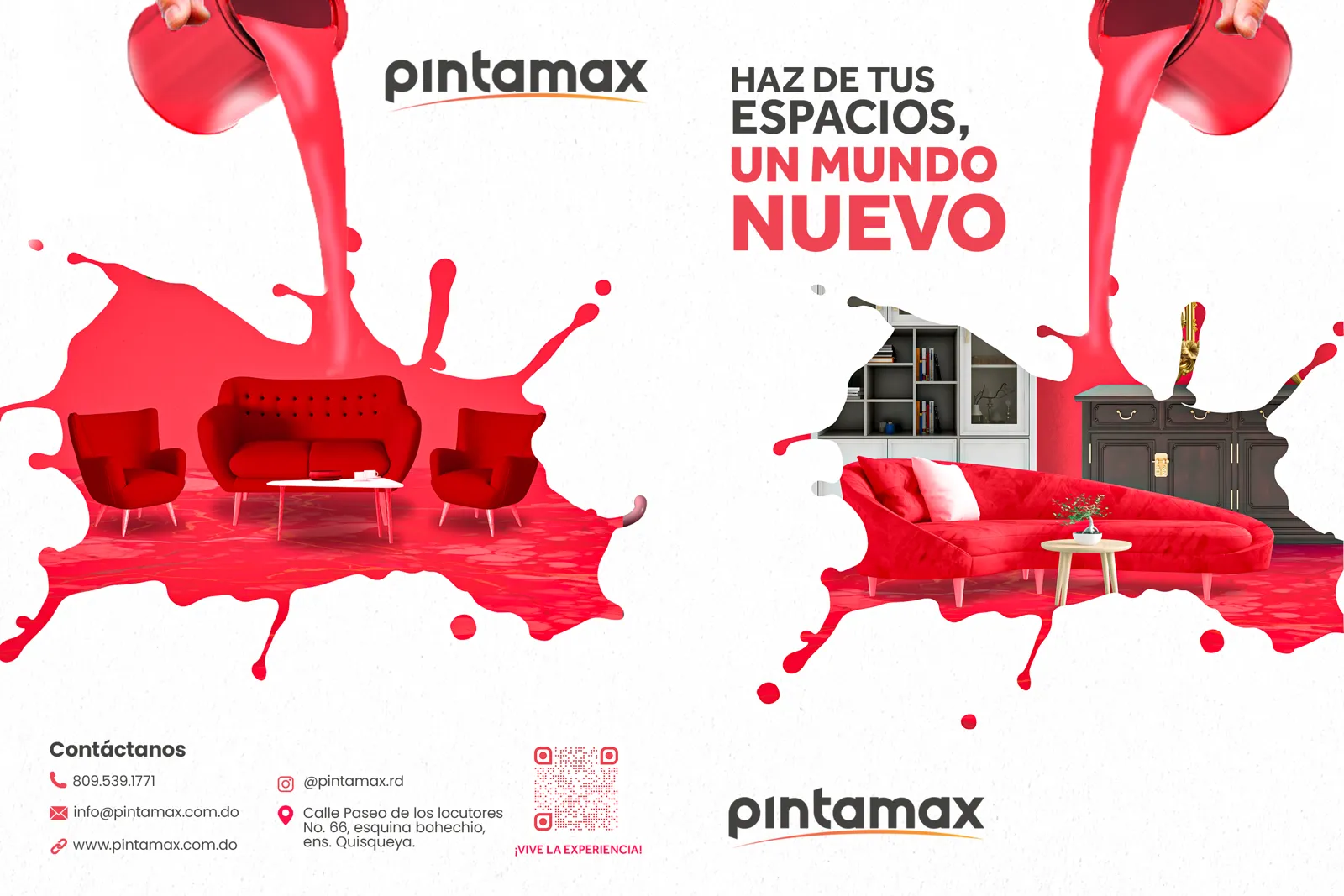
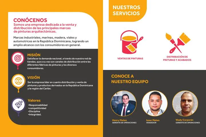
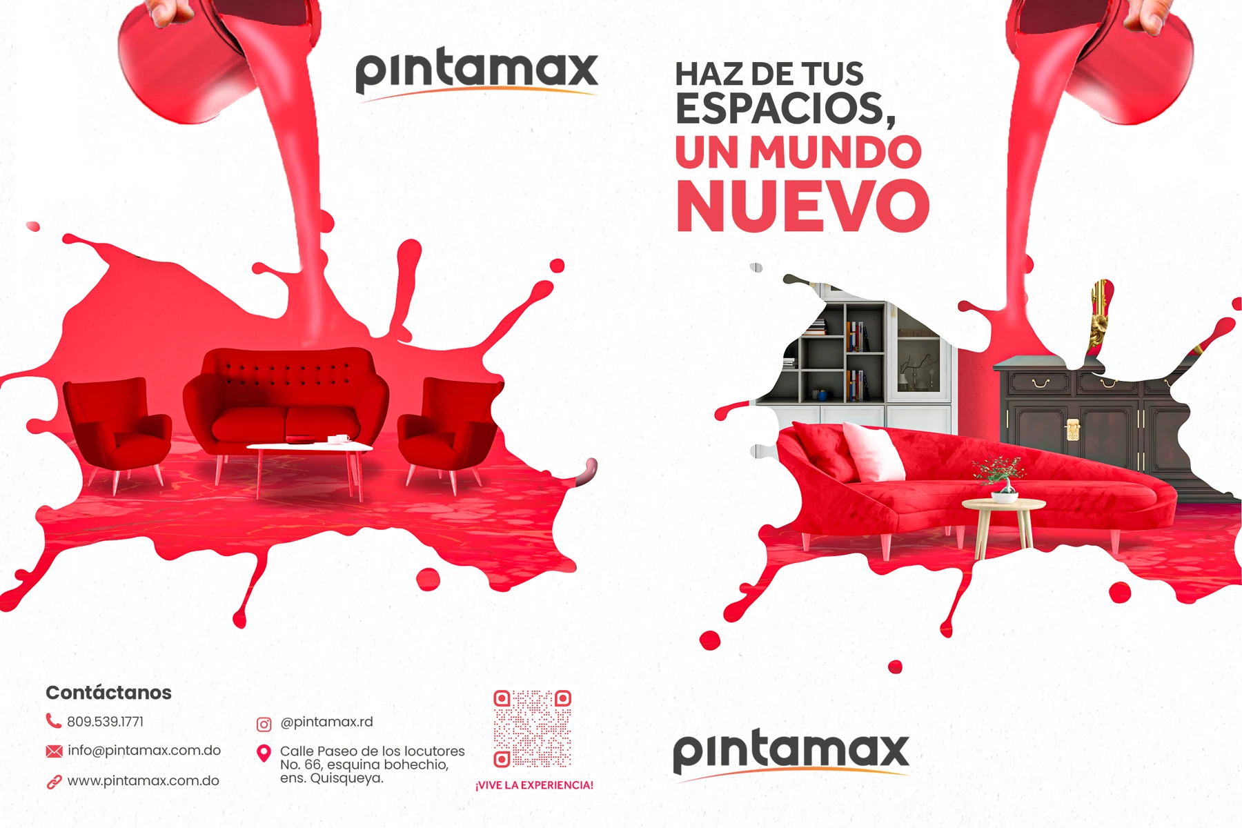
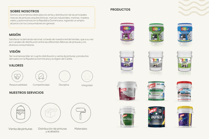
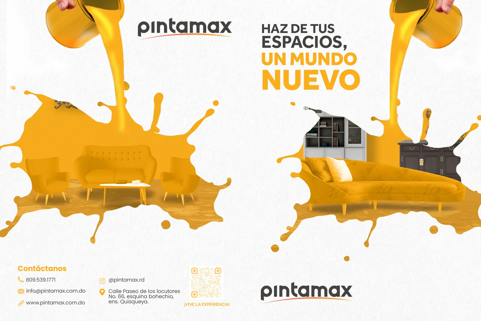
  4. Brochure. A two-sided institutional piece, with earlier proposals.
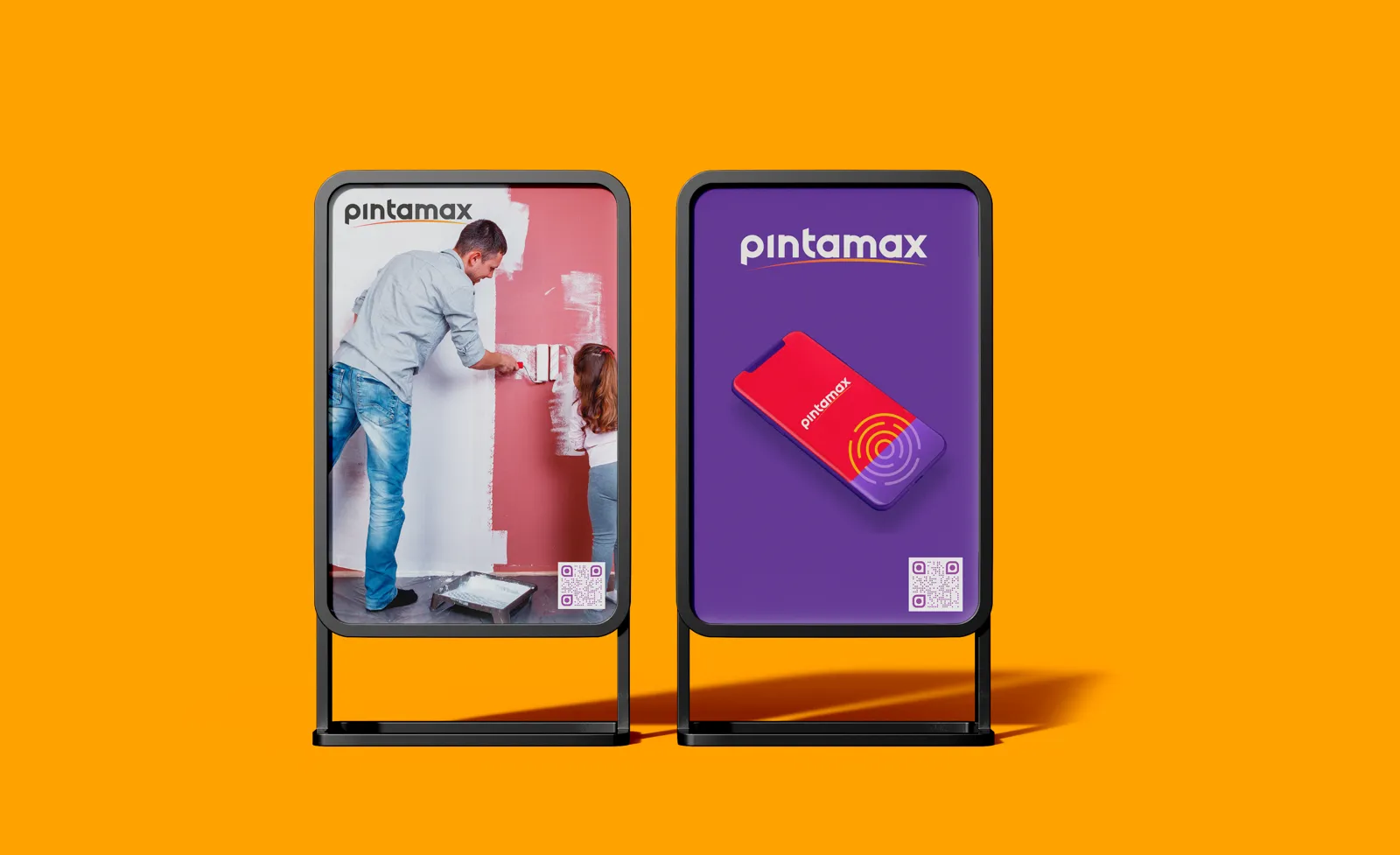
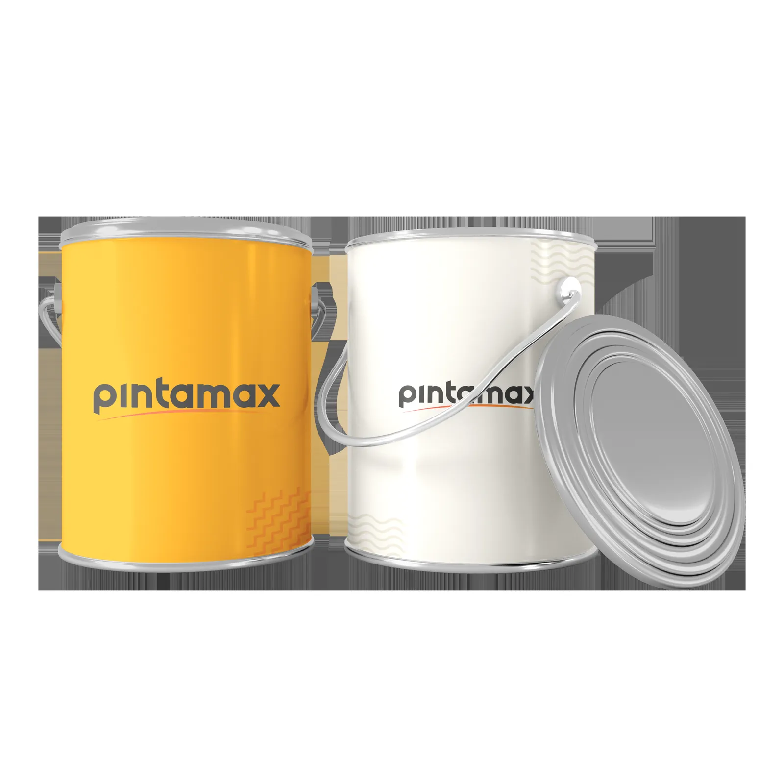
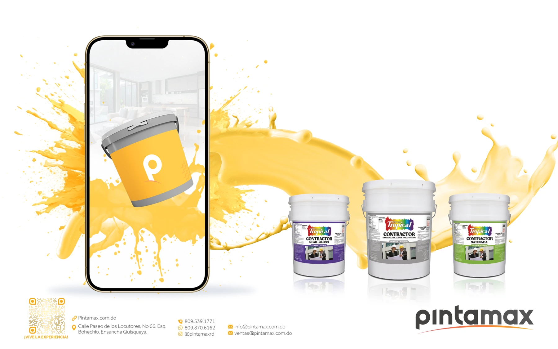
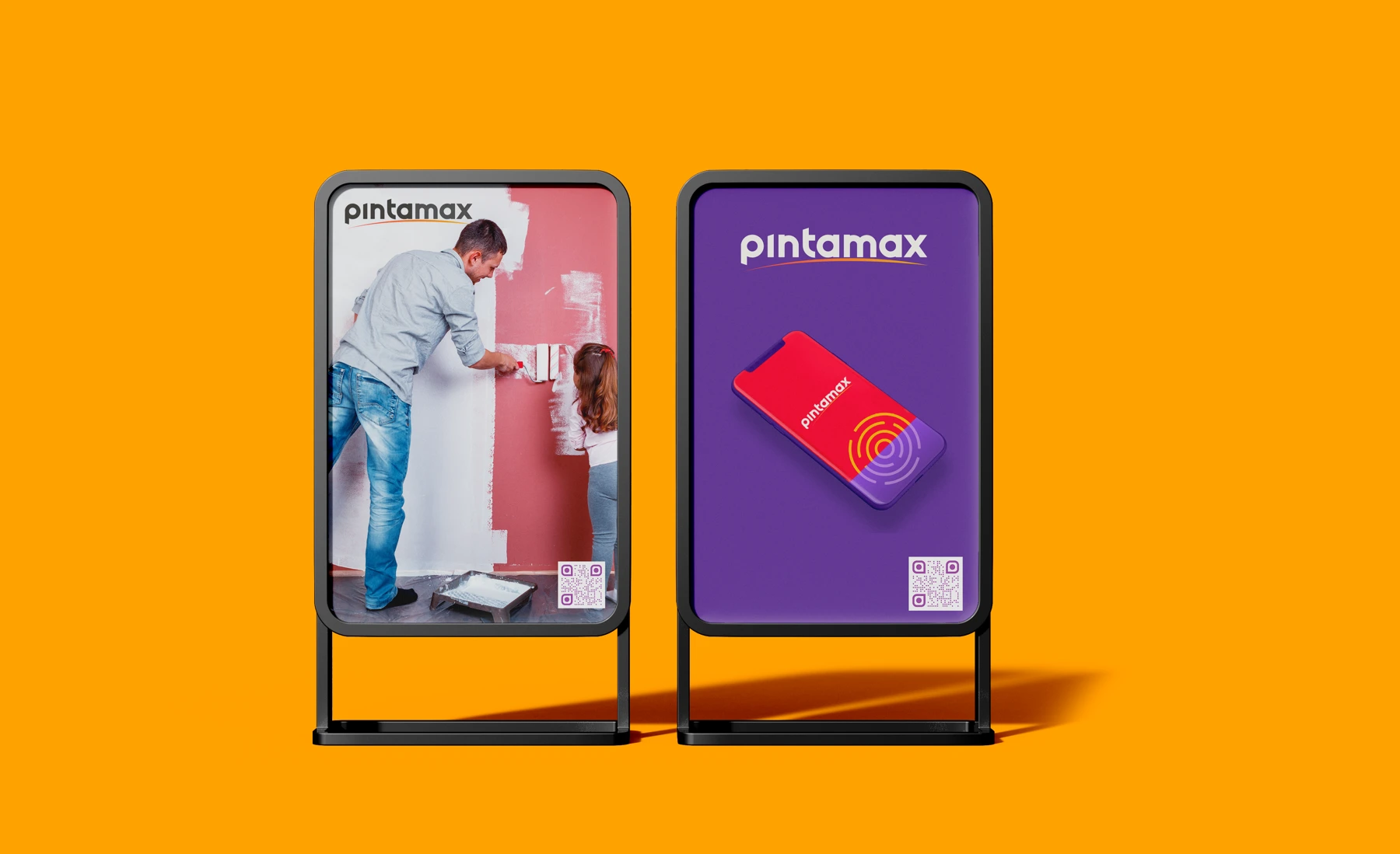
  5. Execution proposal. Visualisations of the brand in store, on screens, billboards and murals.

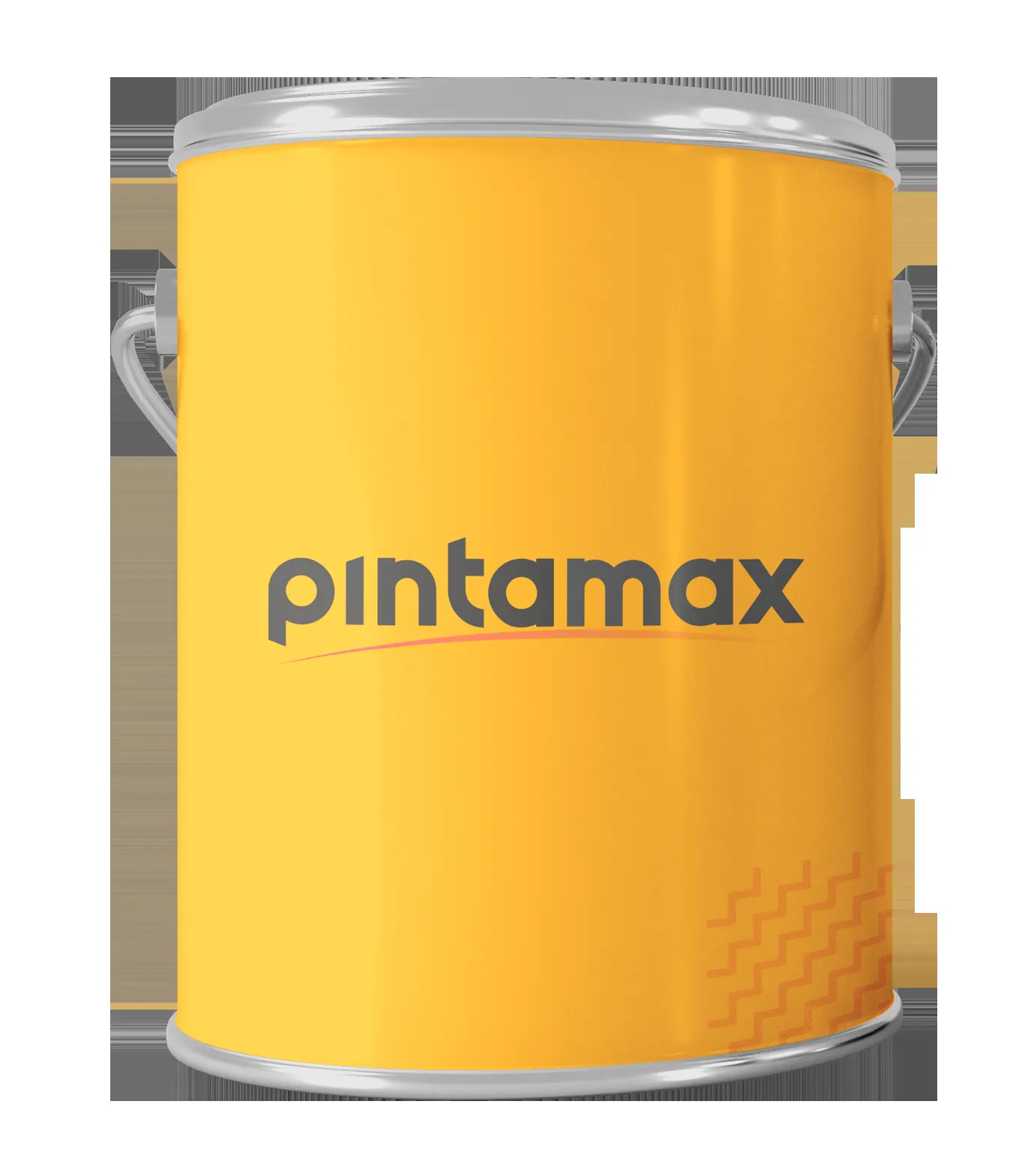
A brand made of colour

Paint colours become part of the graphic language; the guidelines set out how they are used.

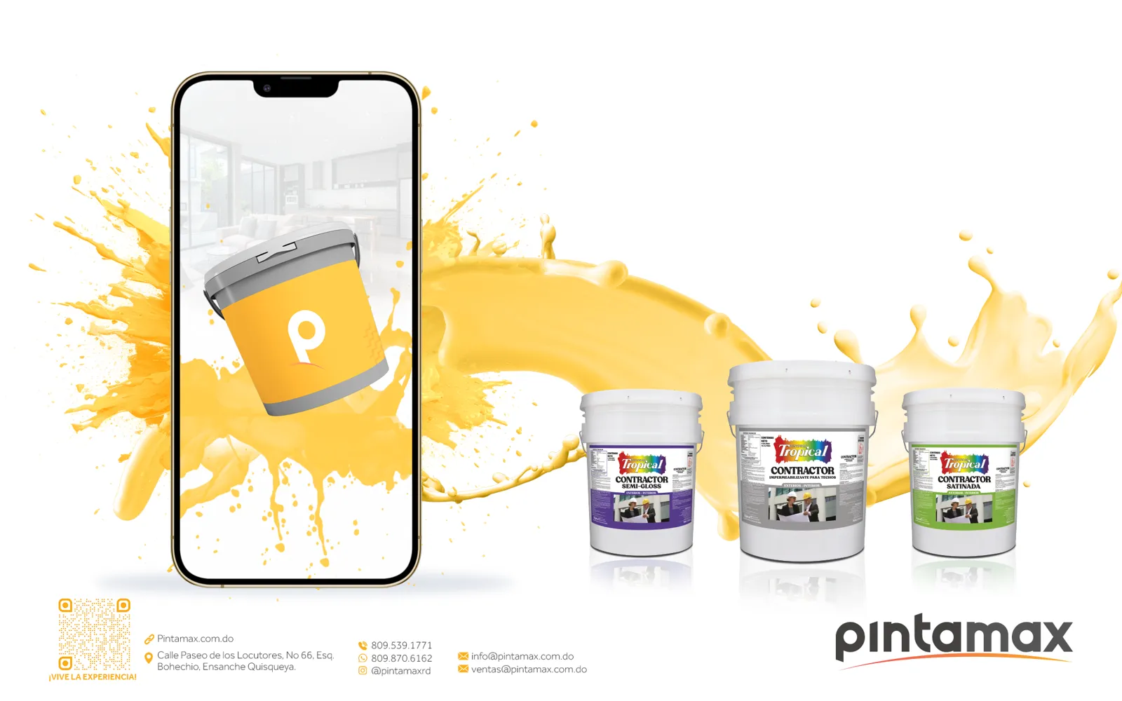
Presenting the company and its products

Both sides of the brochure bring together company information, services and photography in one system.

You decide the next step

What do you need to
change?

Write my brief