The challenge
A furniture brand needed its own visual language for social media.
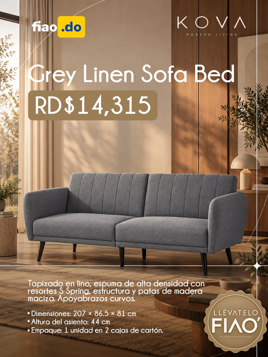
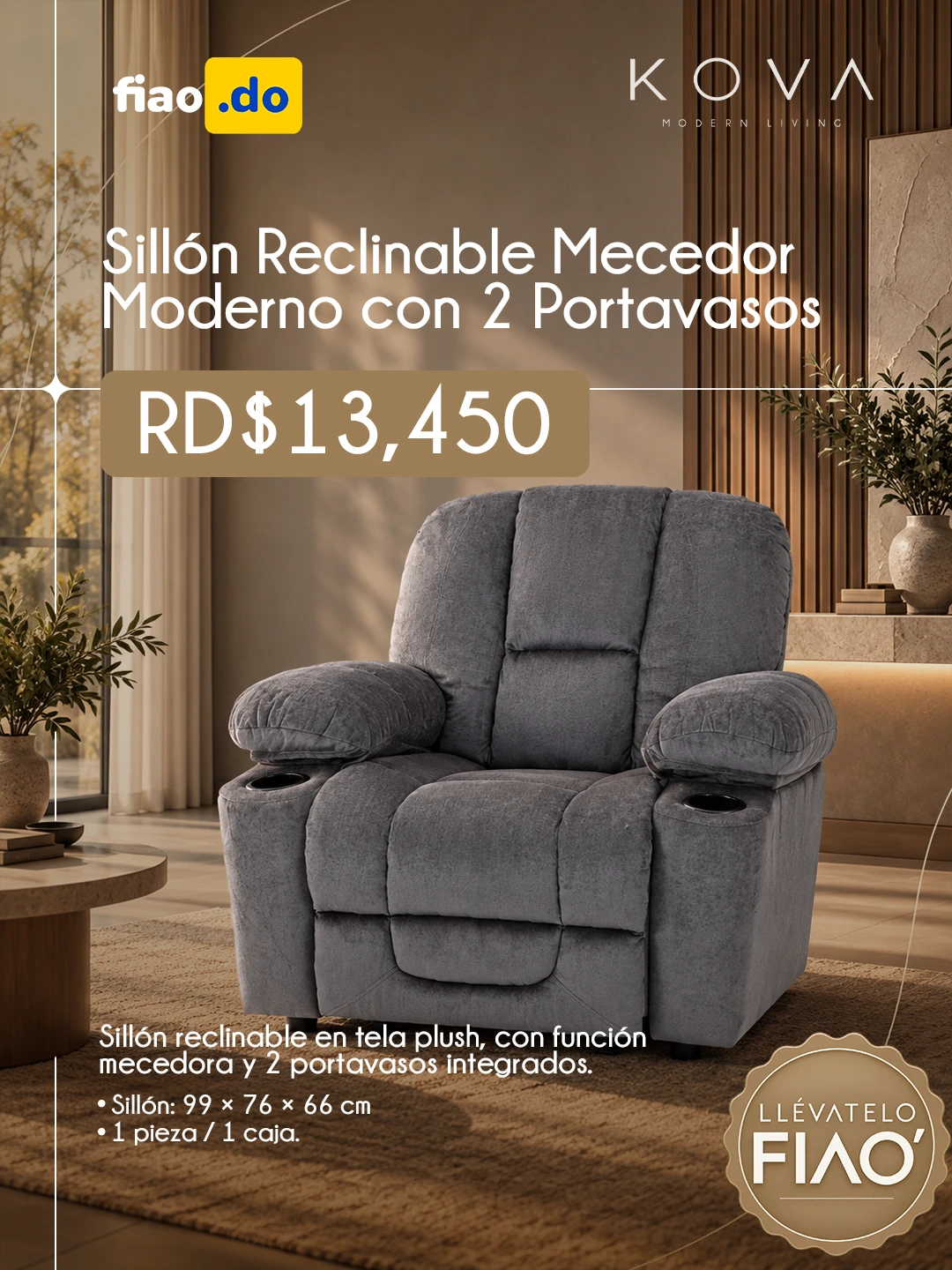
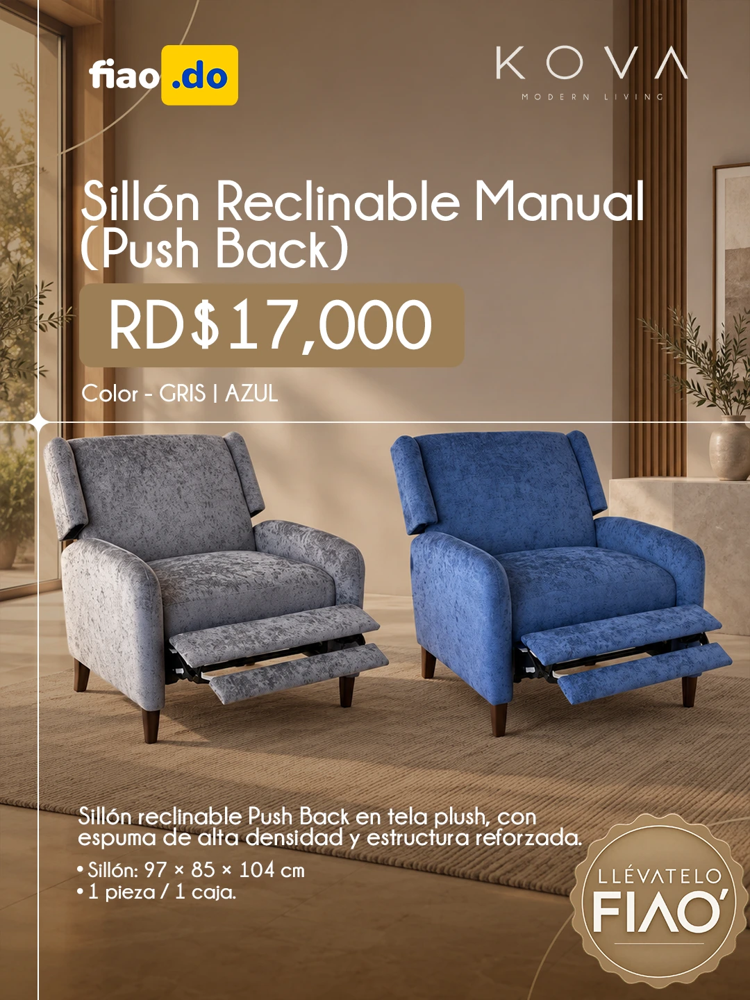
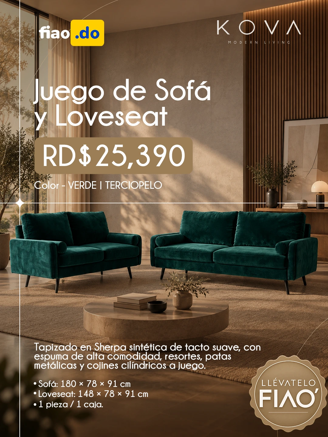
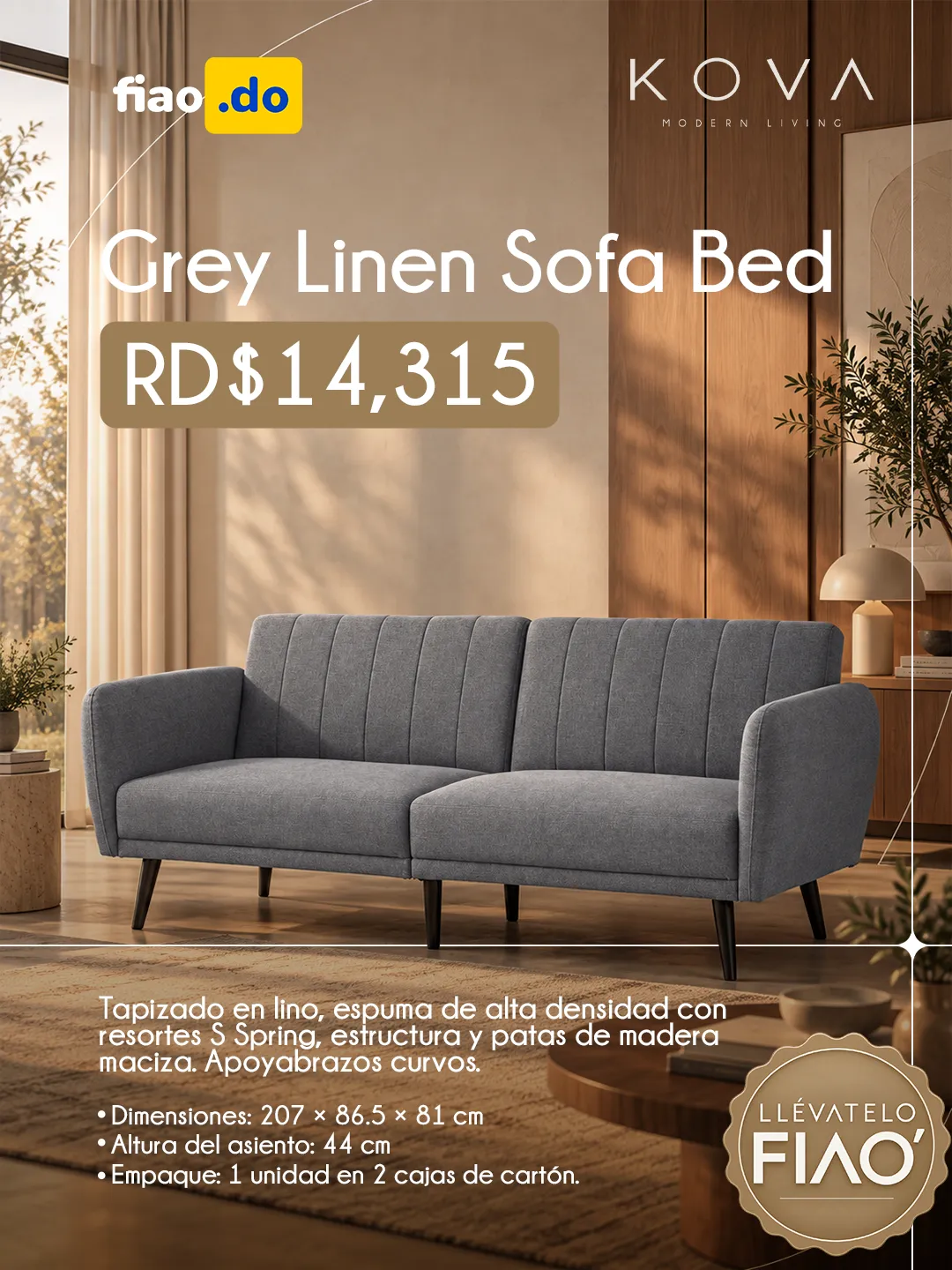
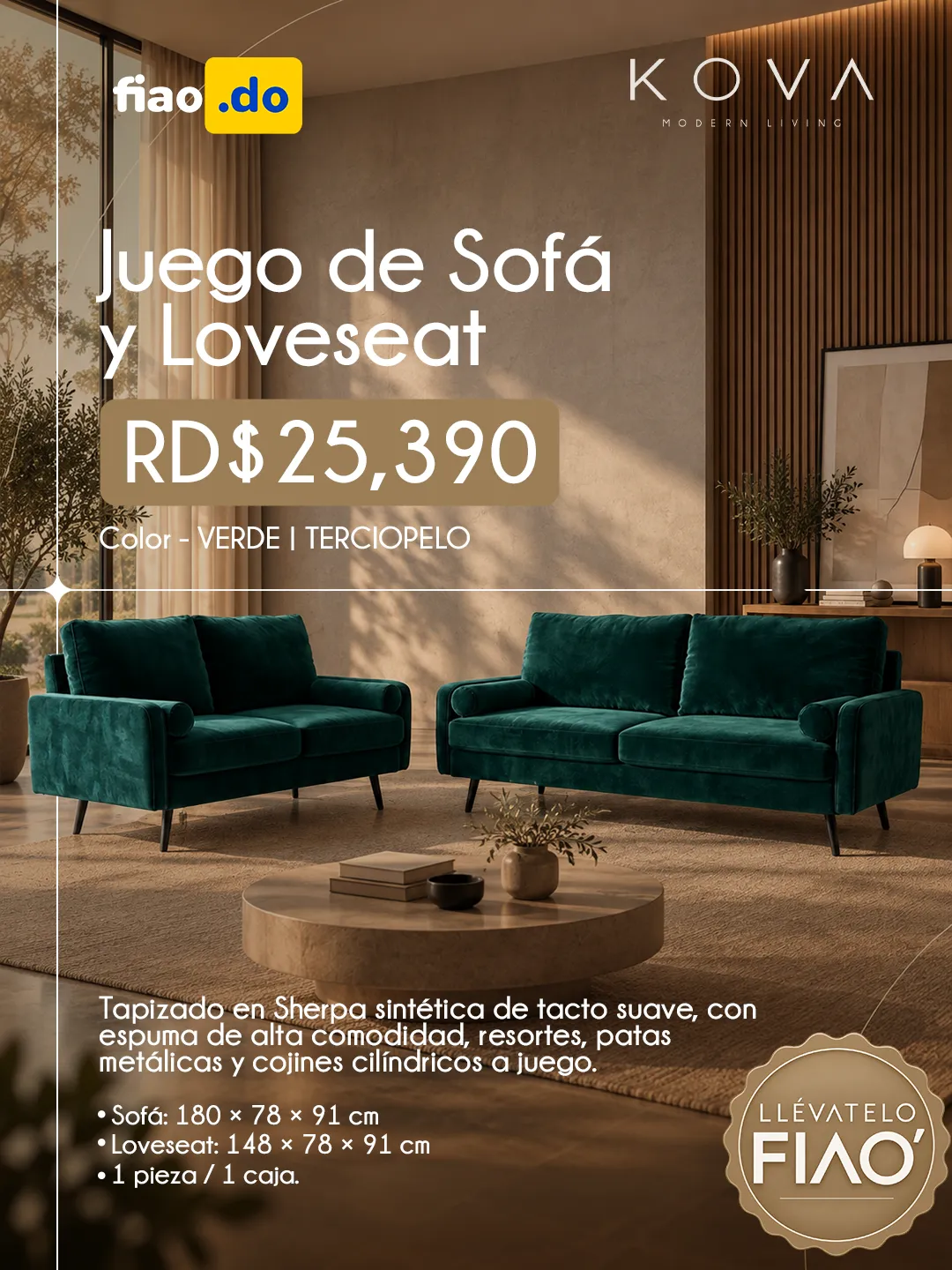
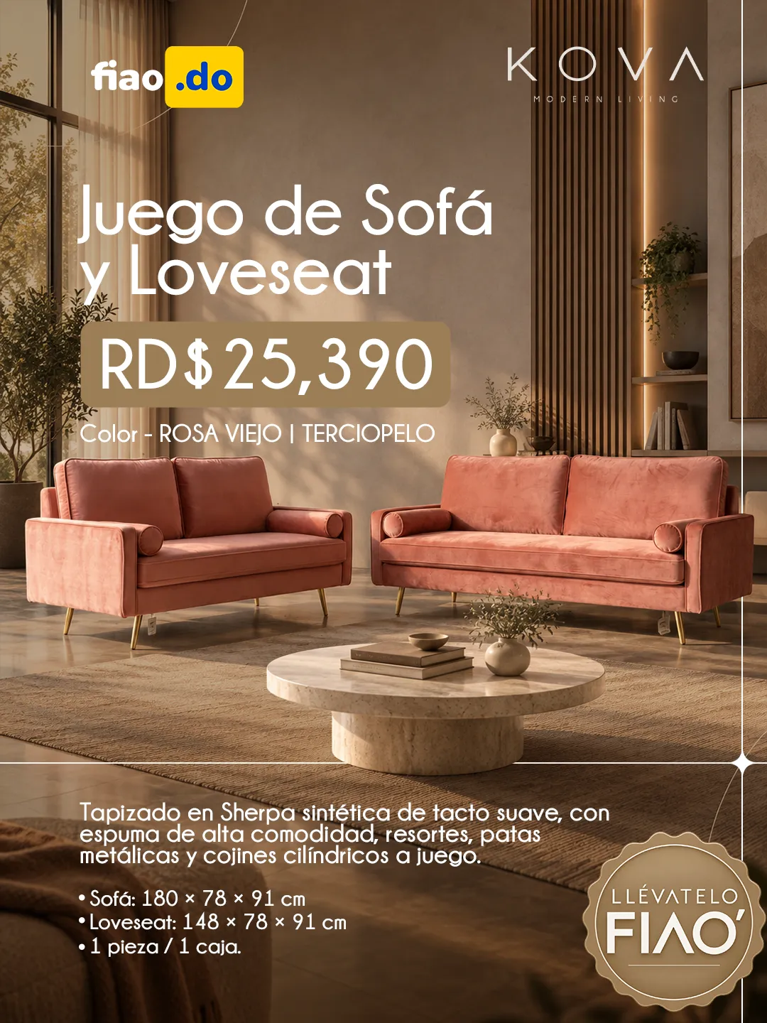
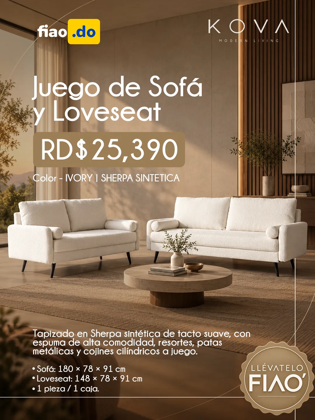
Every post had to show the product, identify the brand and communicate the offer, without the whole looking like a flat catalogue.

KOVA
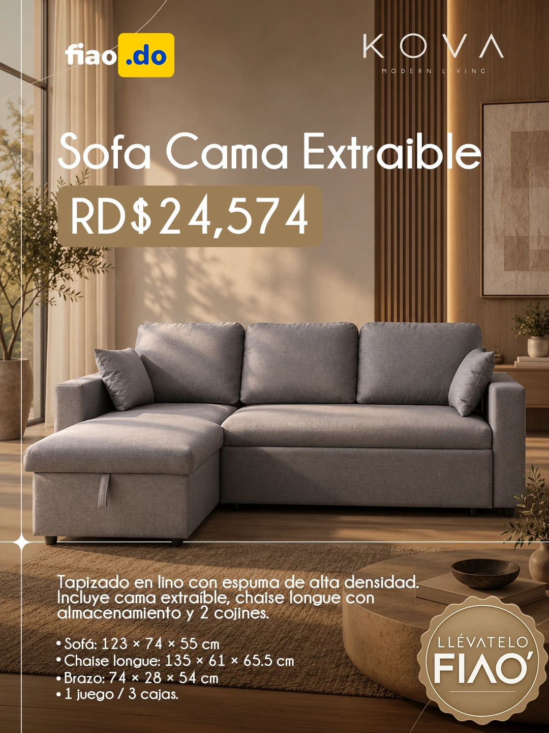
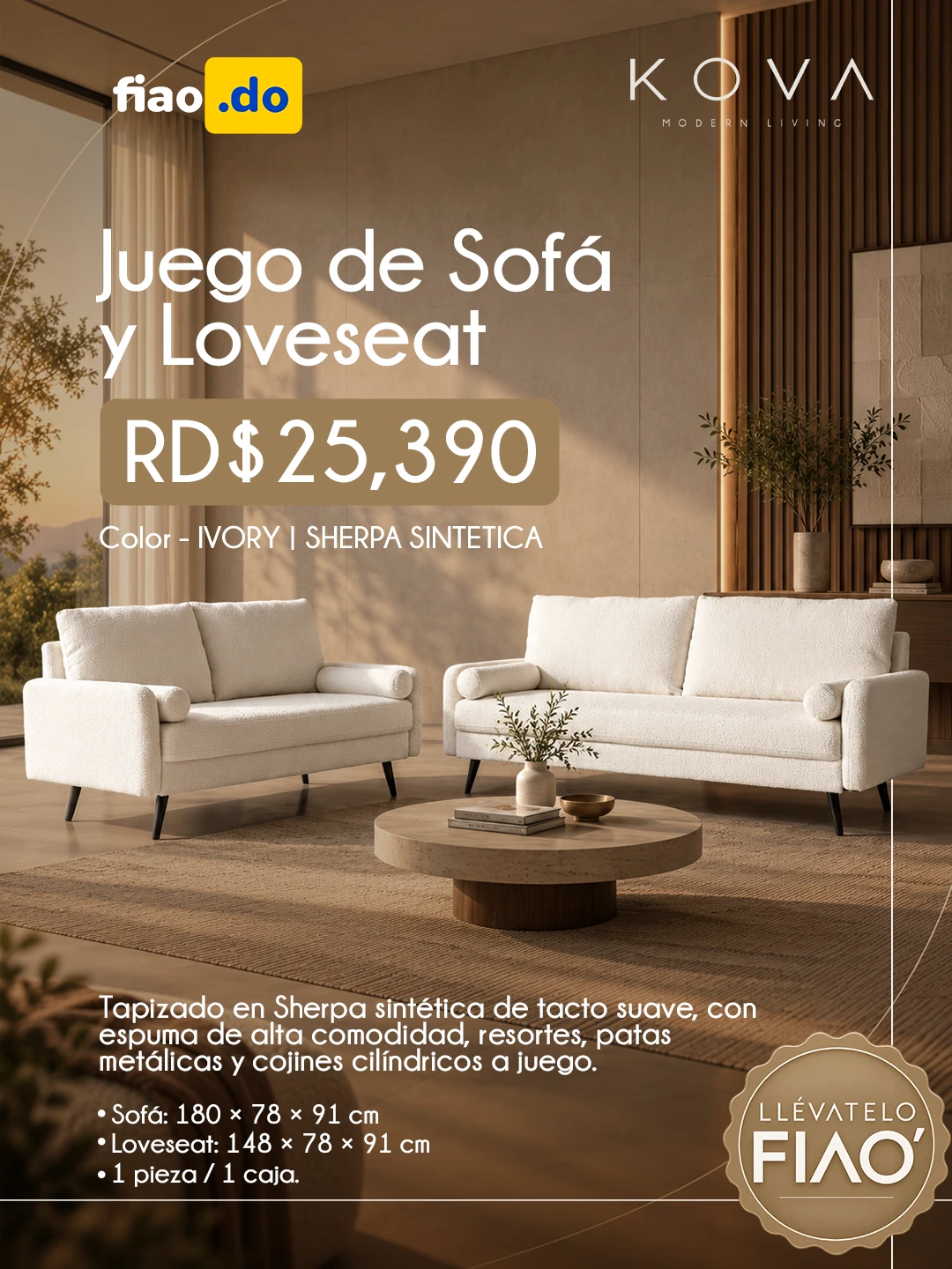
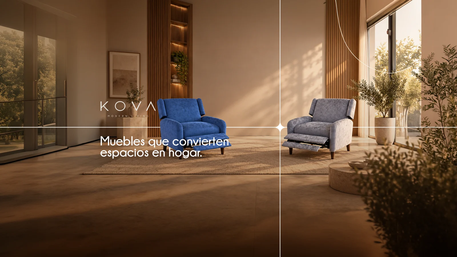
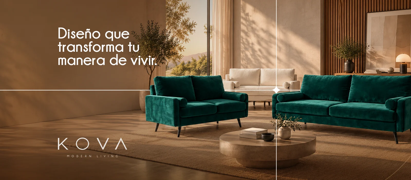
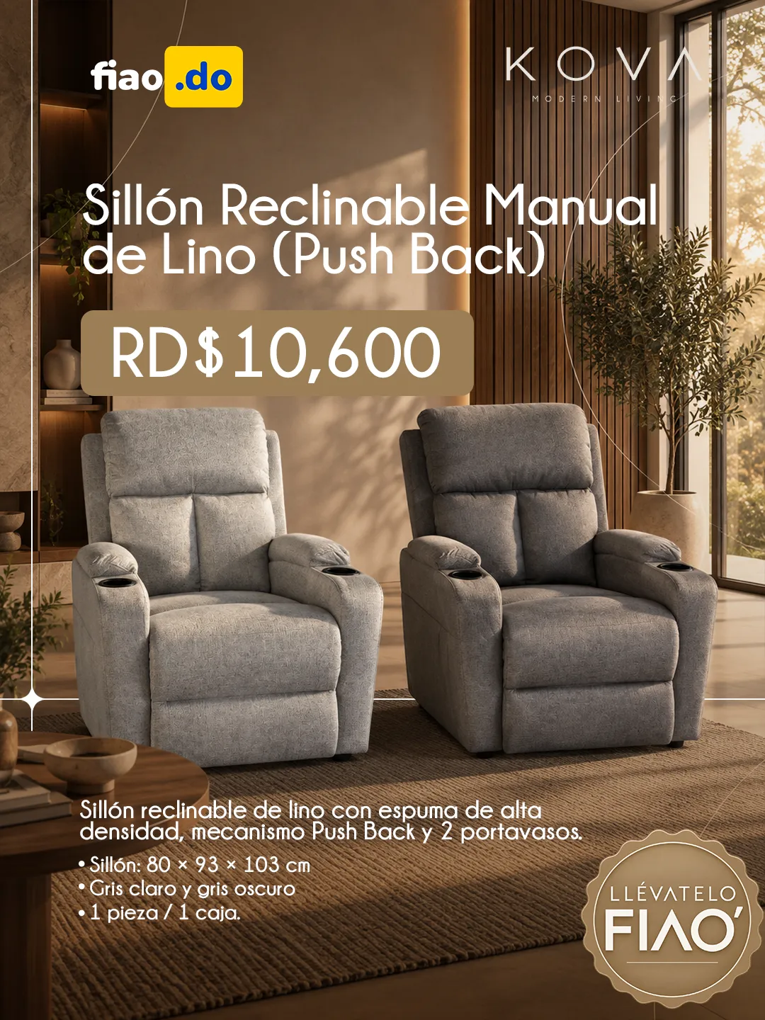
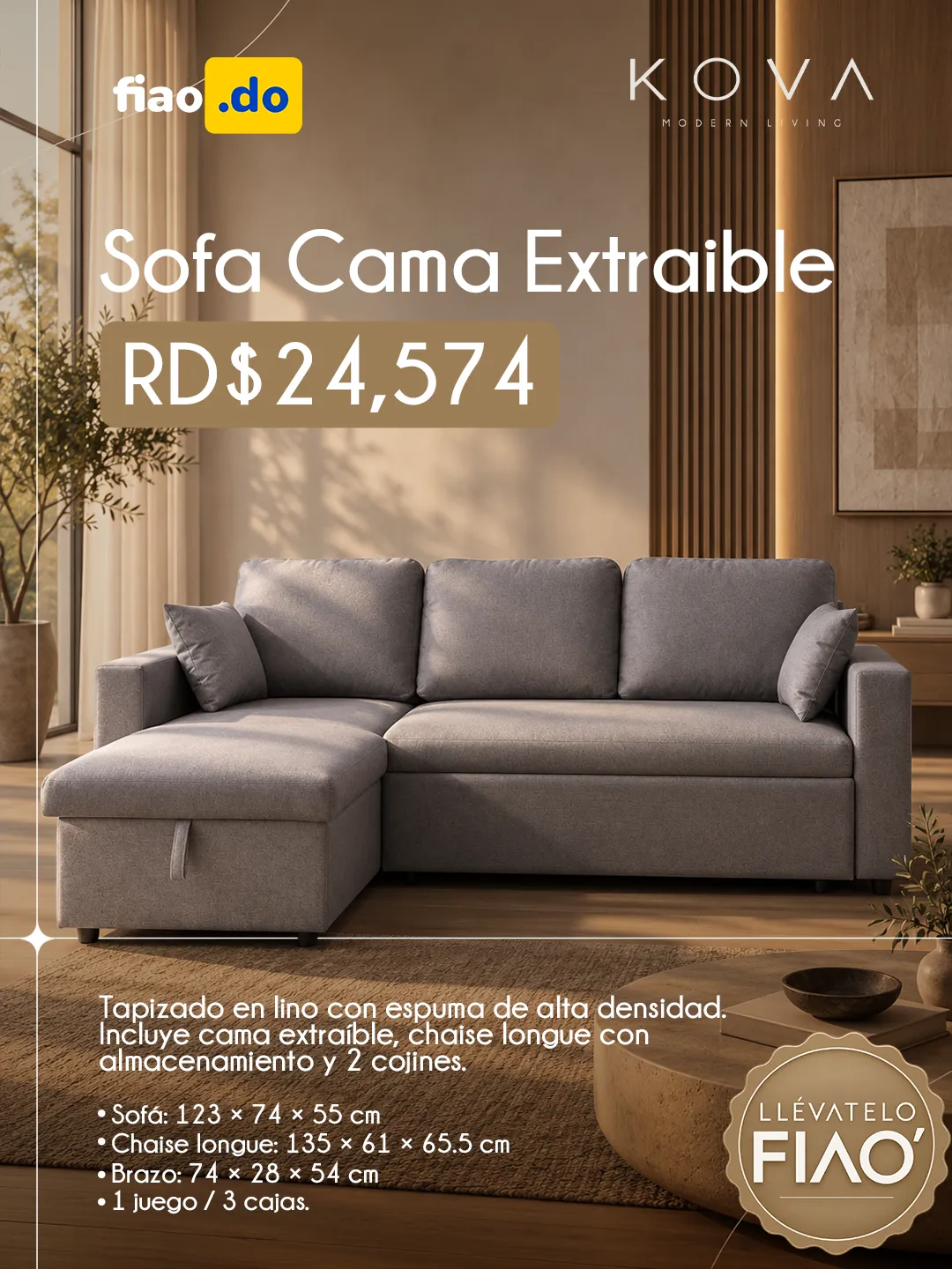
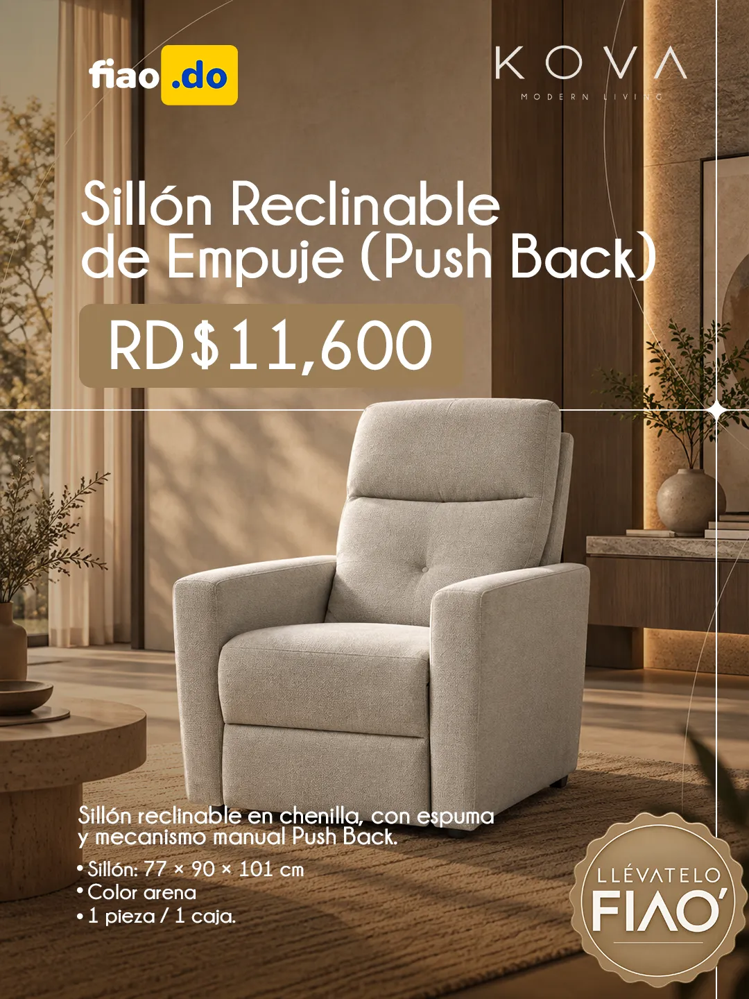
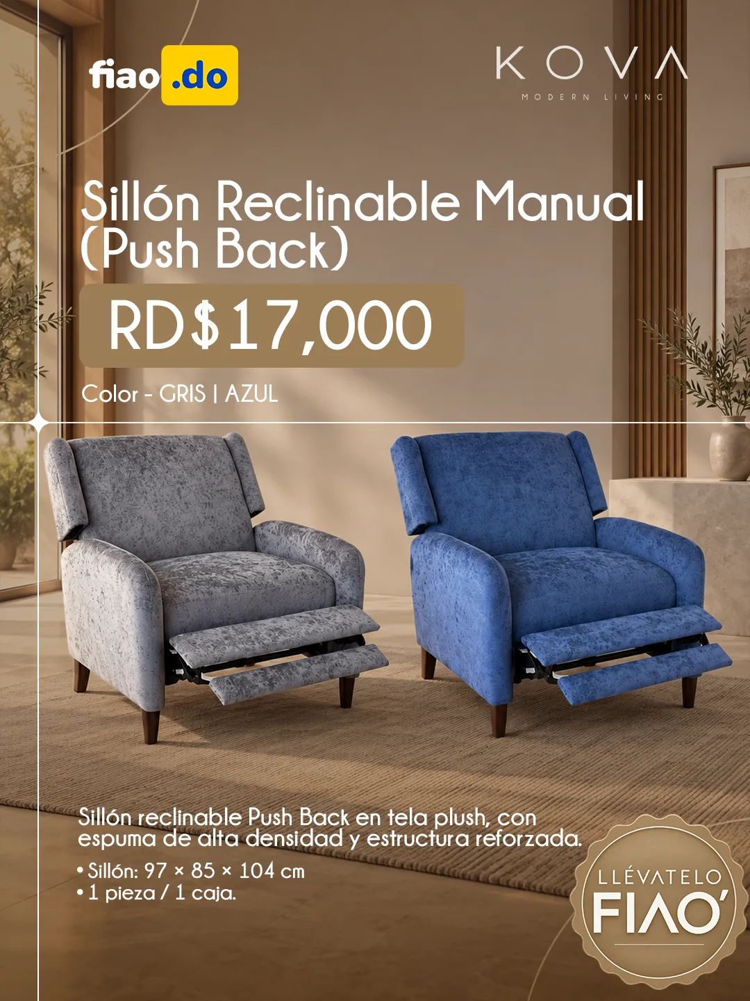
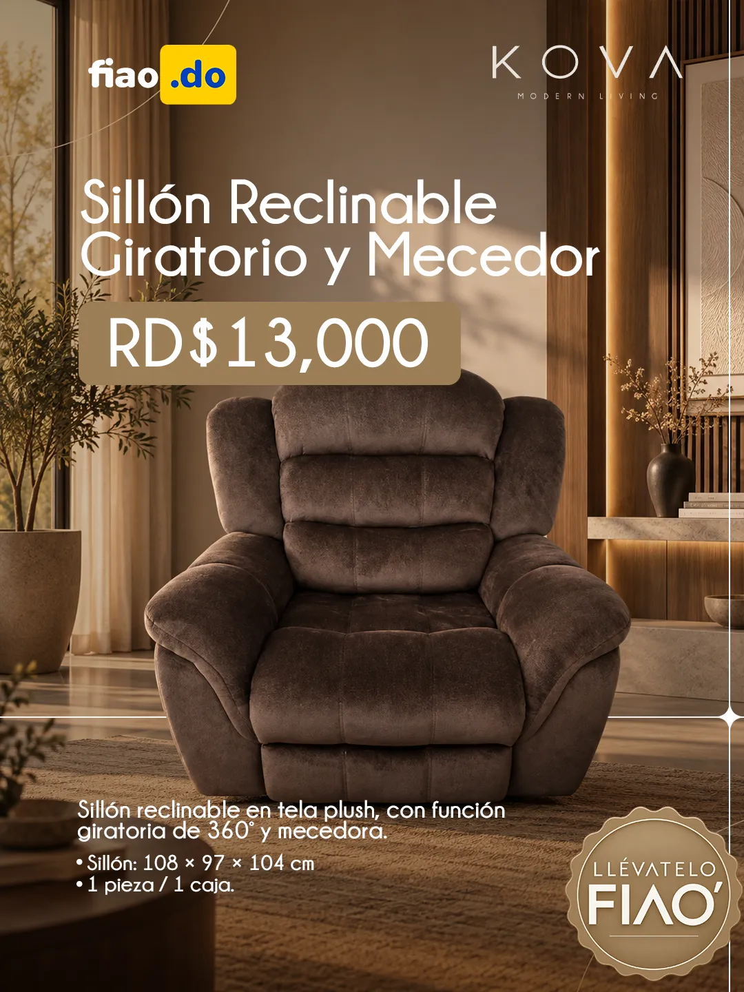
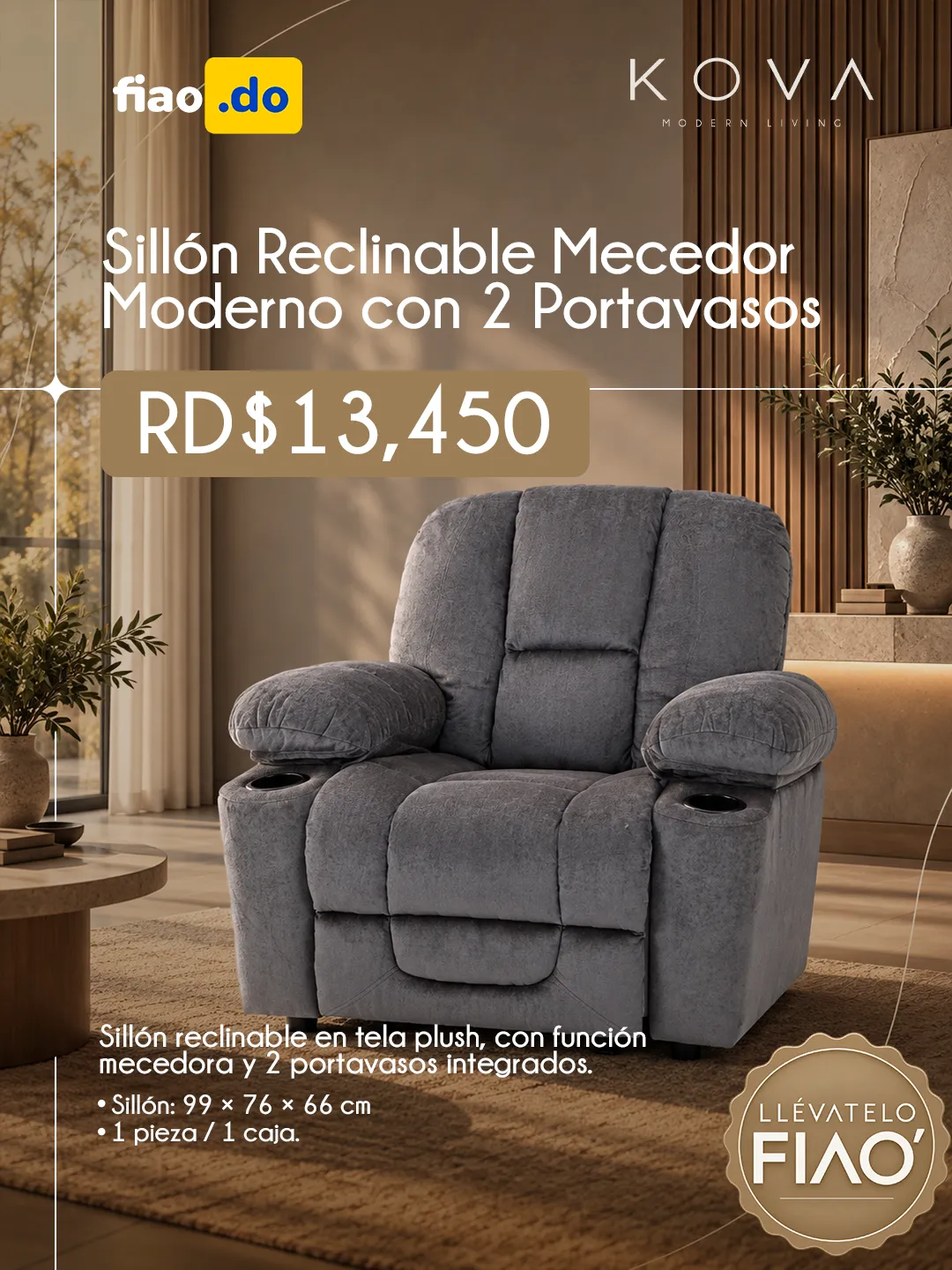
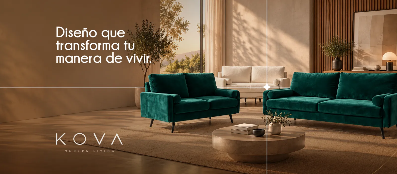
Headers and furniture posts combining product imagery, offer information and a warm-toned graphic setting.
Content · Product
A furniture brand needed its own visual language for social media.
Every post had to show the product, identify the brand and communicate the offer, without the whole looking like a flat catalogue.
A warm graphic setting where the product leads.
Sofa-bed and armchair ads sit alongside the social covers in one system. Visible offers and prices belong to the historical material.