The challenge
Big3 Brothers needed an identity proposal.
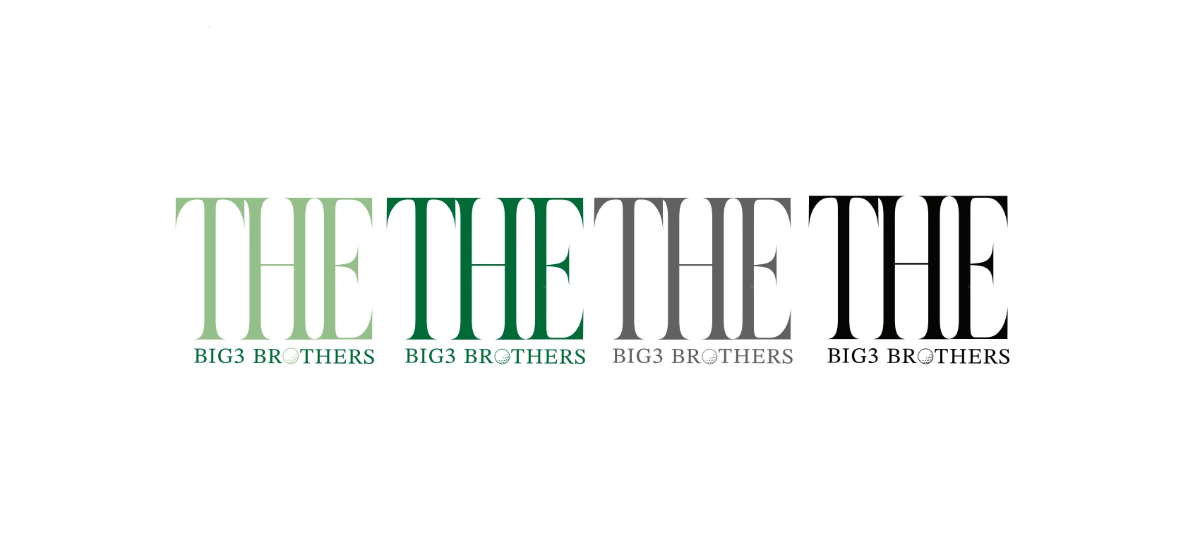
The work explored how to build the name as a typographic system and how it behaves in colour, horizontally and over photography.

Big3 Brothers
Exploration of a typographic identifier and its application variants.
Identity · Exploration
Big3 Brothers needed an identity proposal.
The work explored how to build the name as a typographic system and how it behaves in colour, horizontally and over photography.
Test the identifier in several contexts.